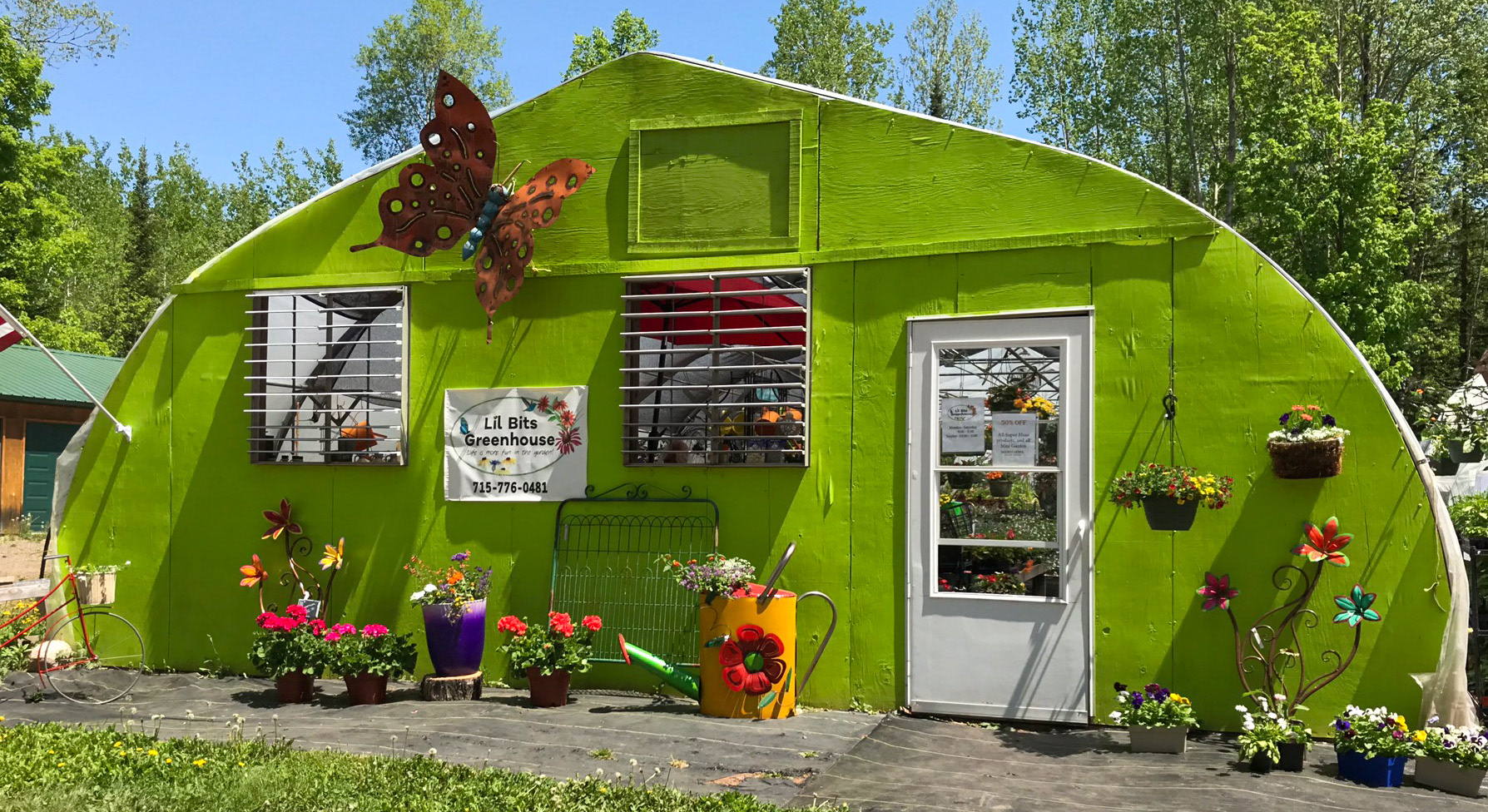
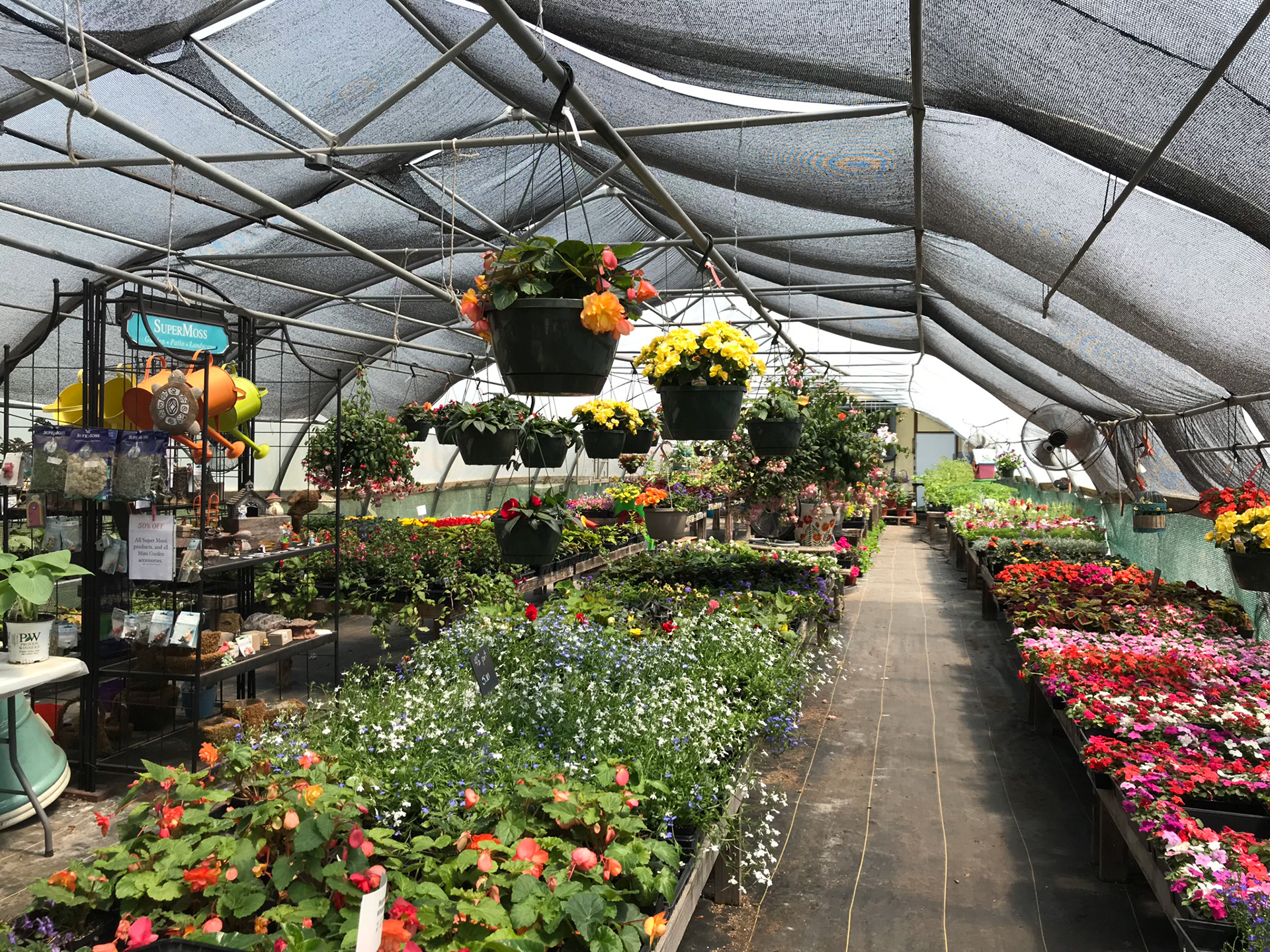
Client overview
Lil Bits Greenhouse was a seasonal, single-location greenhouse in northern Wisconsin, locally owned and primarily operated by the owner for 10 years. Each year, the majority of plants were grown on-site from early seedlings. The greenhouse served adults in the area who valued quality, personalized service, locally grown plants, and convenience in their plant shopping.
Prior to formal graphic design training, I originally developed the Lil Bits Greenhouse logo along with business cards, print collateral, social media graphics, and newspaper advertisements. That early work laid the foundation for the brand and supported the business during its active seasons.
The rebrand shown below revisits the identity through a more refined and strategic lens. While the updated visuals were not ultimately implemented due to the business closing, the project reflects growth in my approach to typography, hierarchy, color strategy, and overall brand cohesion.
Deliverables
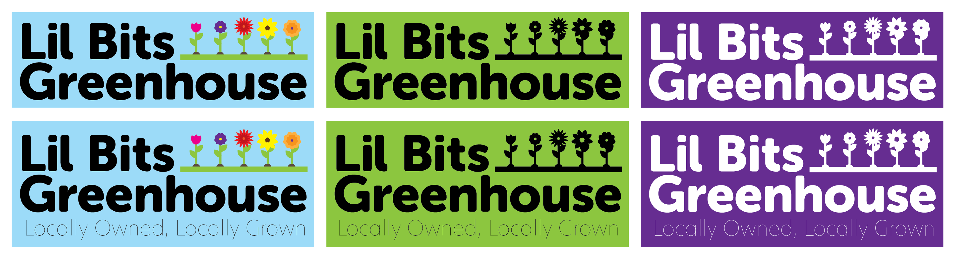
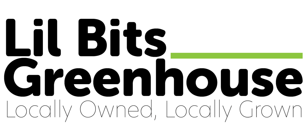
Logo
The original logo was heavy on illustrative detail, used a combination of both raster and vector art, and had multiple decorative elements. While it showed warmth and personality, it did not have clear hierarchy or a wide range of scalability.
The rebrand refines the identity with strong typography and simplified supporting graphics. The reduction in complexity, as well as the use of only vector graphics, improve the versatility of the logo for use in signage, print, and digital spaces.
Animated Logo
A digital animation expands the identity system, bringing the identity to life for digital channels. Created for use across social media and online platforms, the animation is designed to enhance engagement.
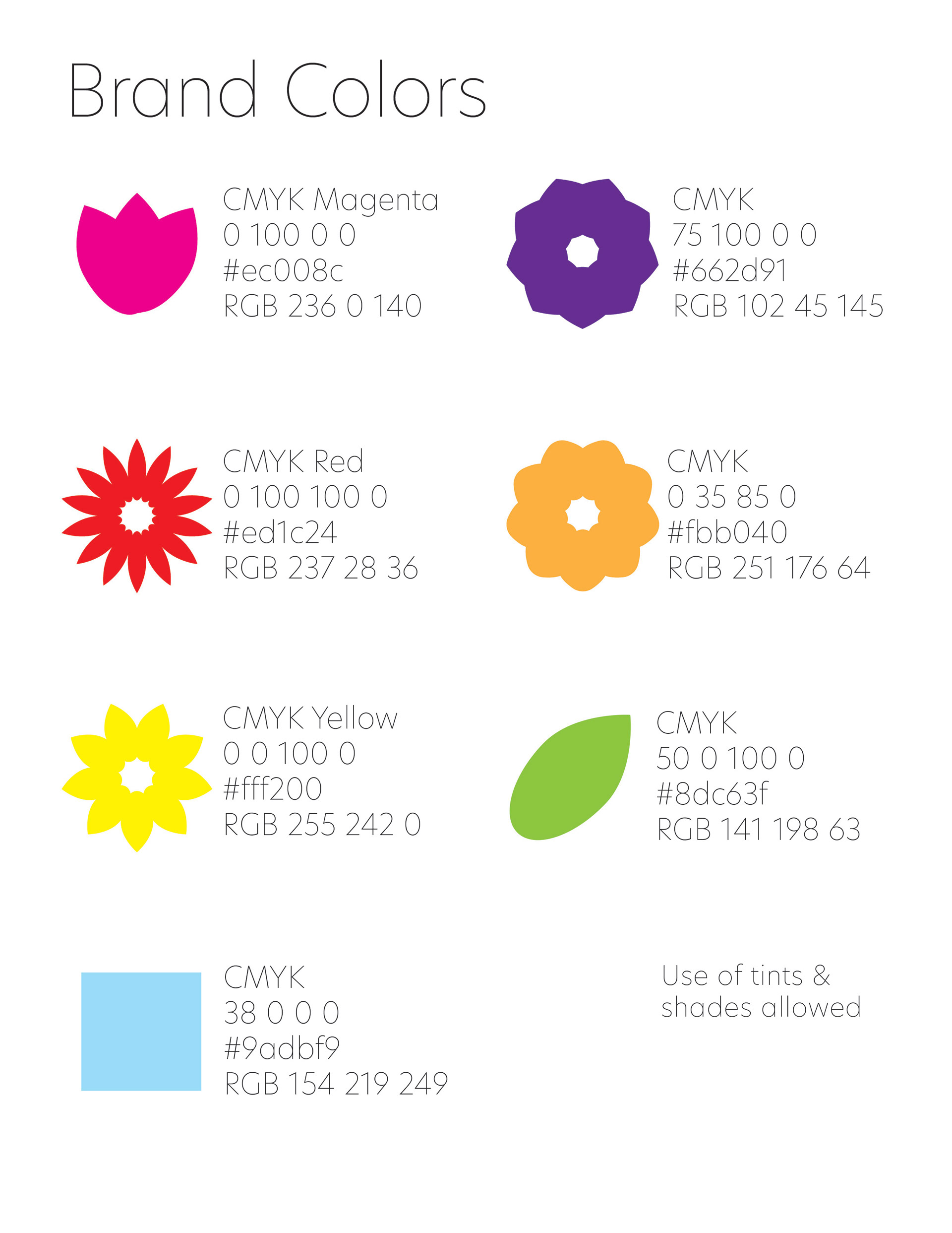
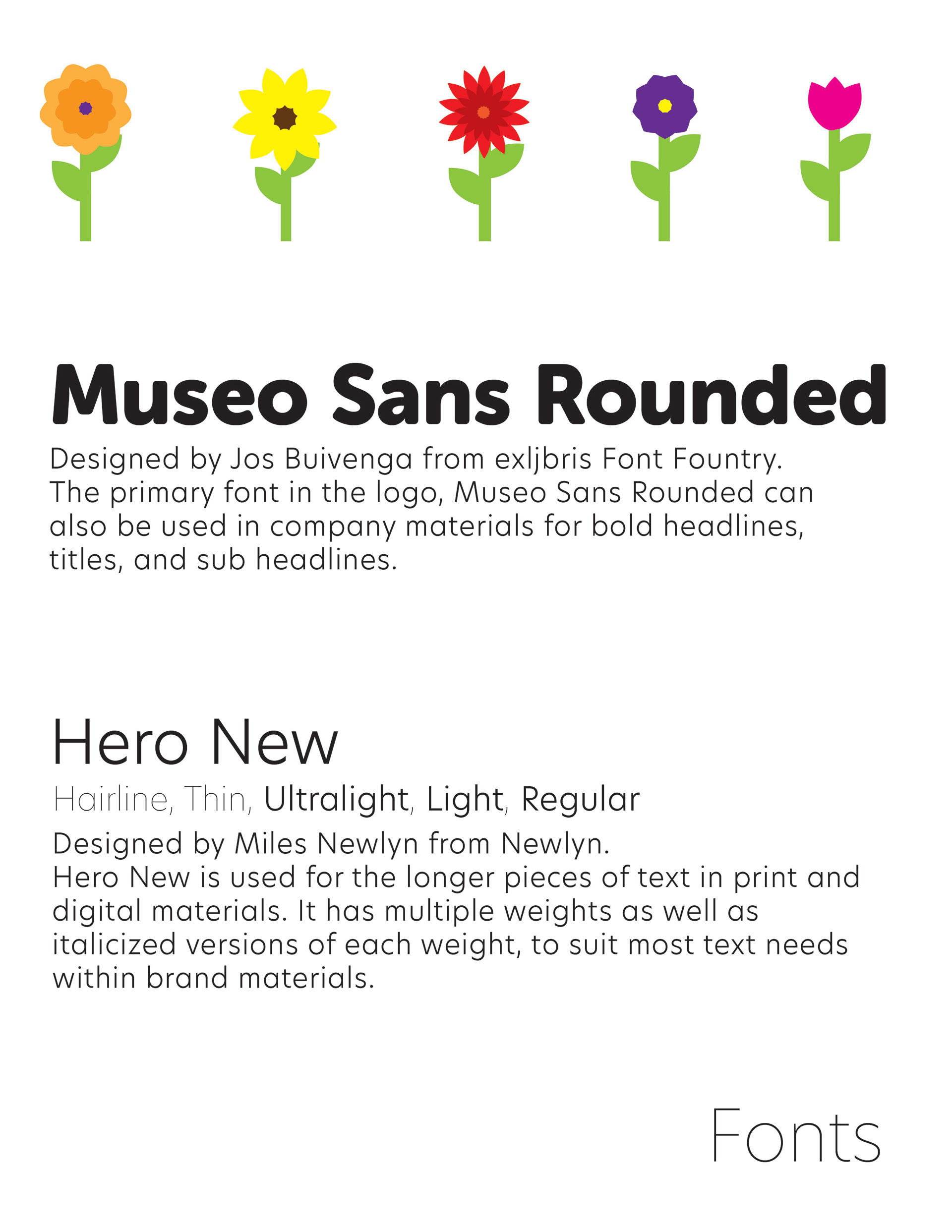
Color & Typography
The original logo and designs used a range of colors that reflected the colors found inside the greenhouse. The rebrand refines this approach with a more intentionally curated palette. The brighter colors were chosen to not only reflect the colorful bright offerings within the greenhouse, but also to go along with the greenhouse's bright green painted entrance wall, which became a unique identifying part of the greenhouse in it's later years.
The rebrand establishes a defined typographic system for consistency beyond the logo. The primary brand font, used in the wordmark, is used to anchor headlines. A secondary font with multiple weights for versatility is designated for subhead and body copy.
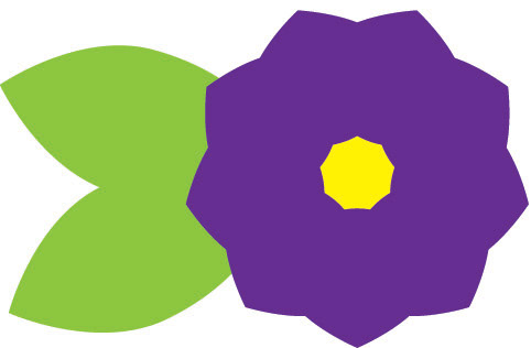
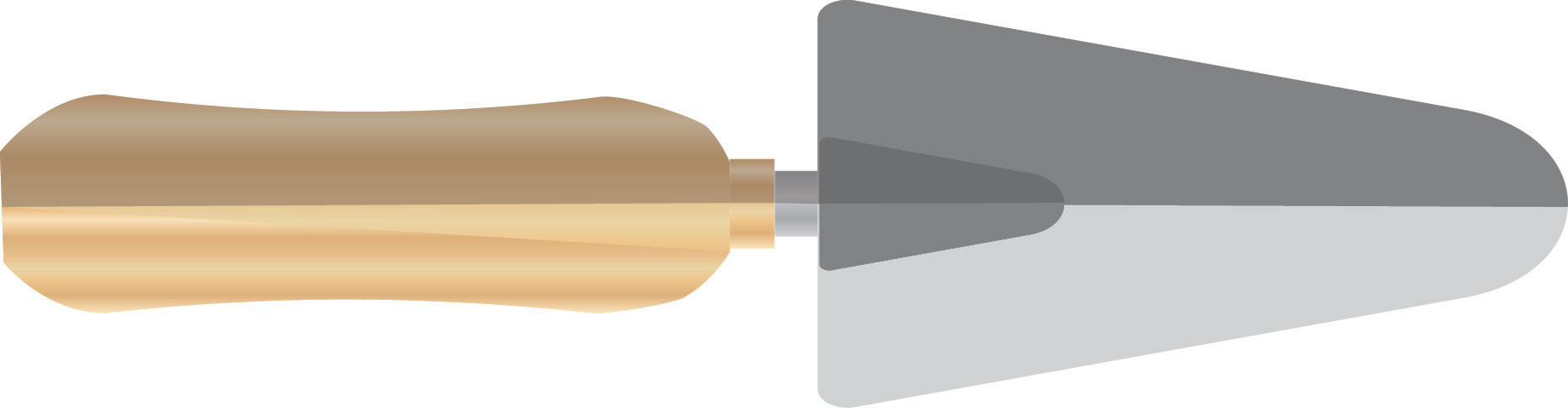
Illustrations
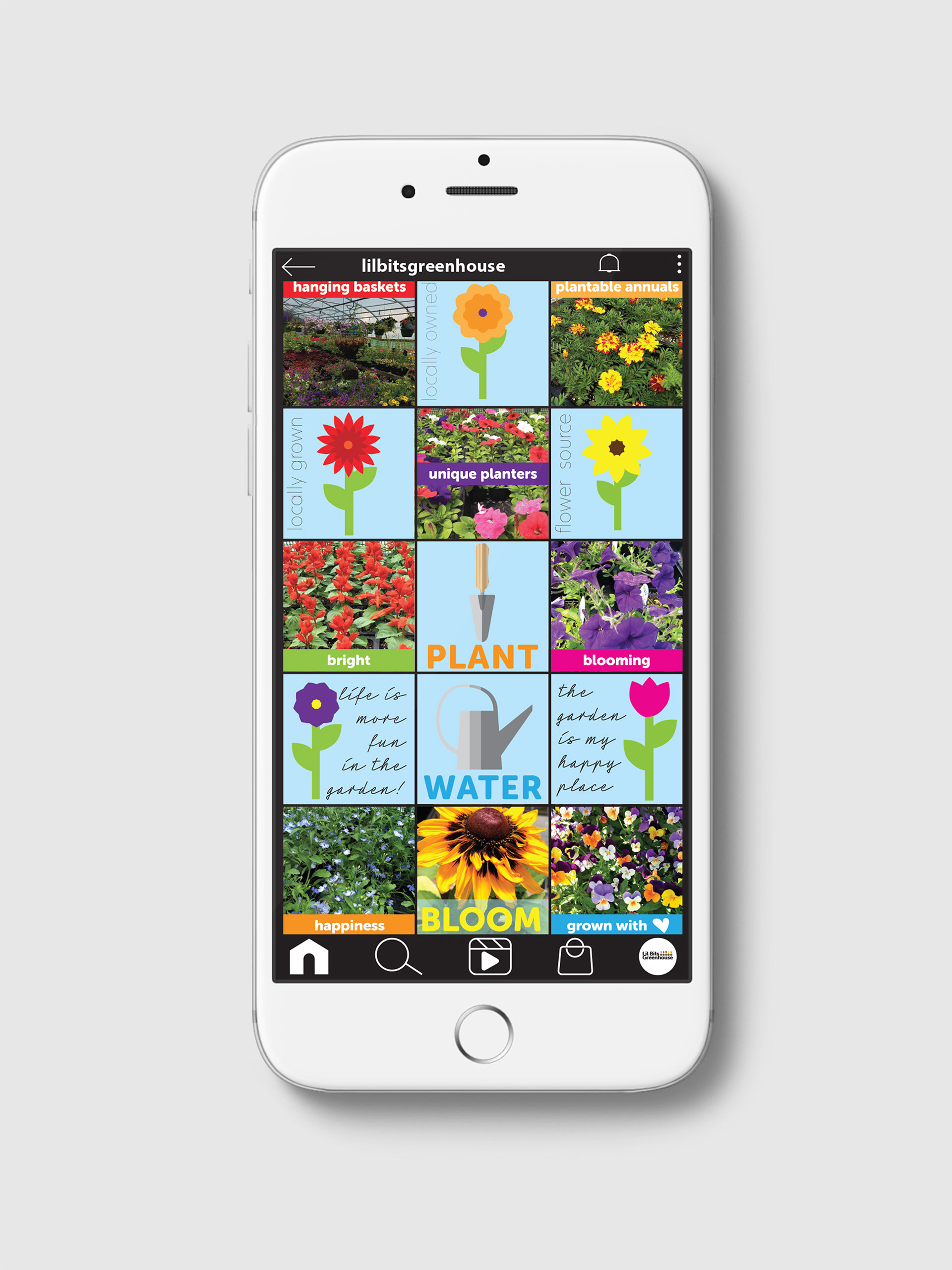
A variety of custom illustrations were developed to extend the identity. Using simplified forms and controlled detail, the illustrations are representative of the character of the brand. Designed to be used as spot graphics and on social media, these illustrations help create visual consistency and add personality.


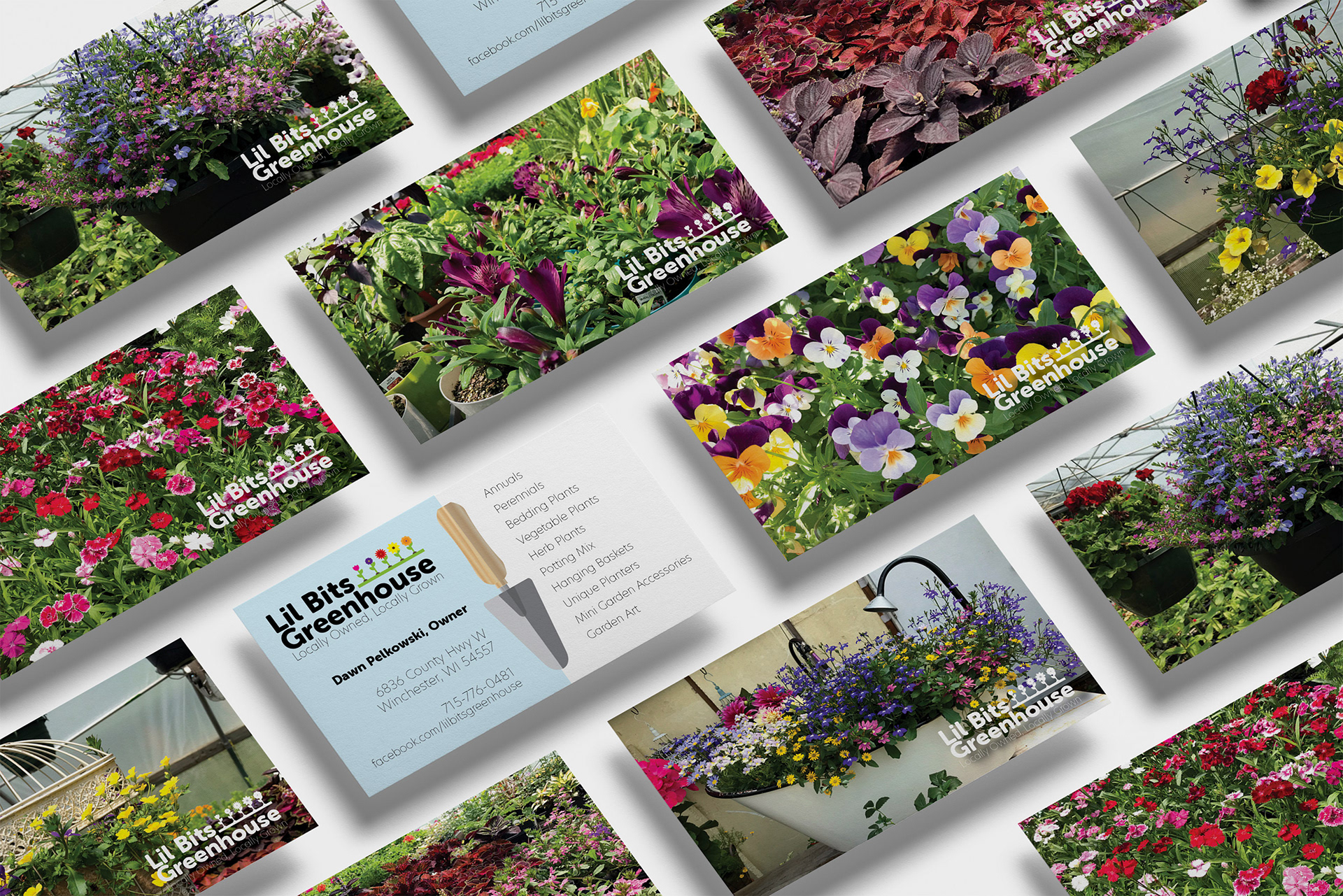
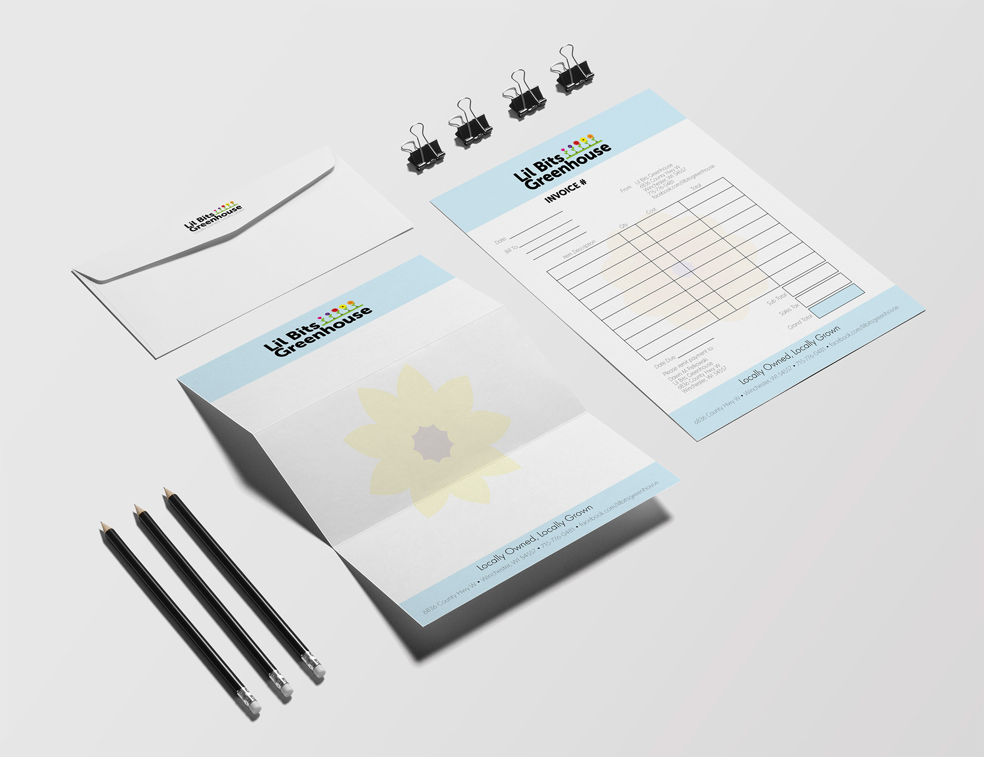
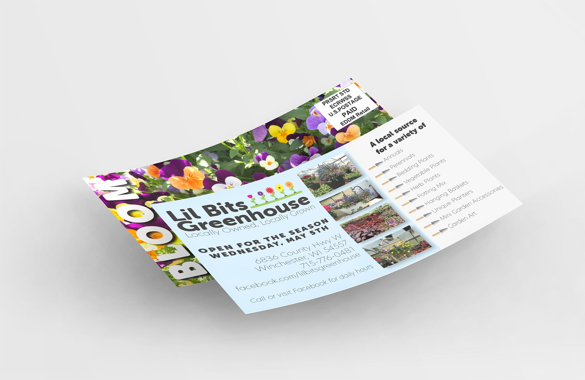
Print Collateral
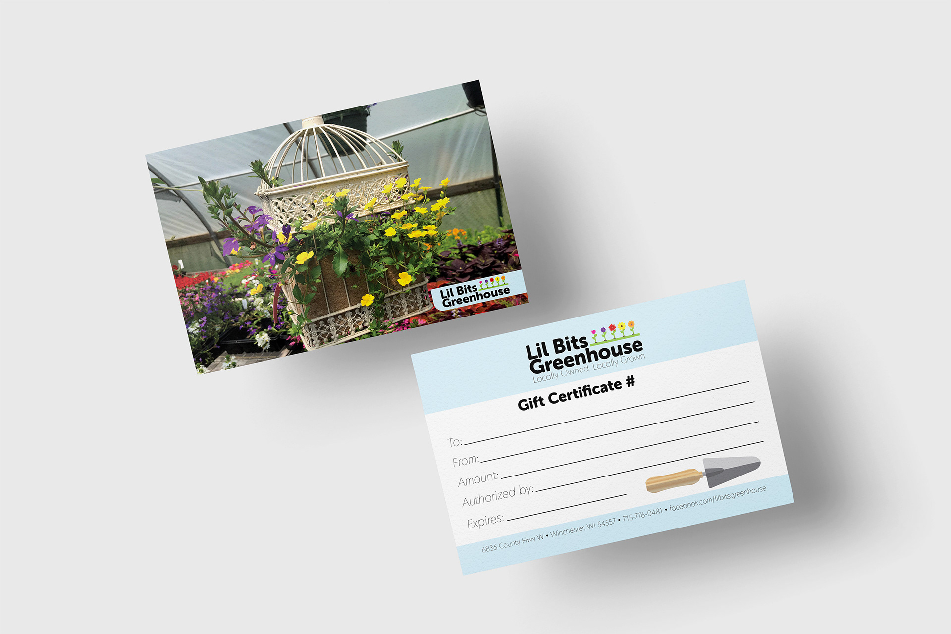
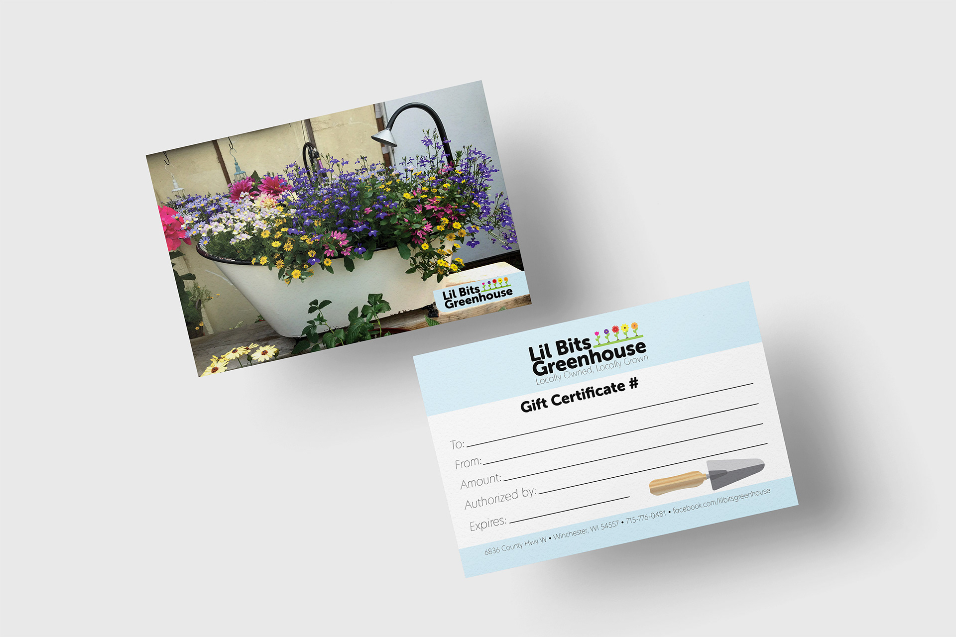
The rebranded elements were used to update the print items used by Lil Bits greenhouse. These include a two-side business card, letterhead, invoice, EDDM large postcard, and a small postcard size gift certificate with variable back-side images.
Social Media
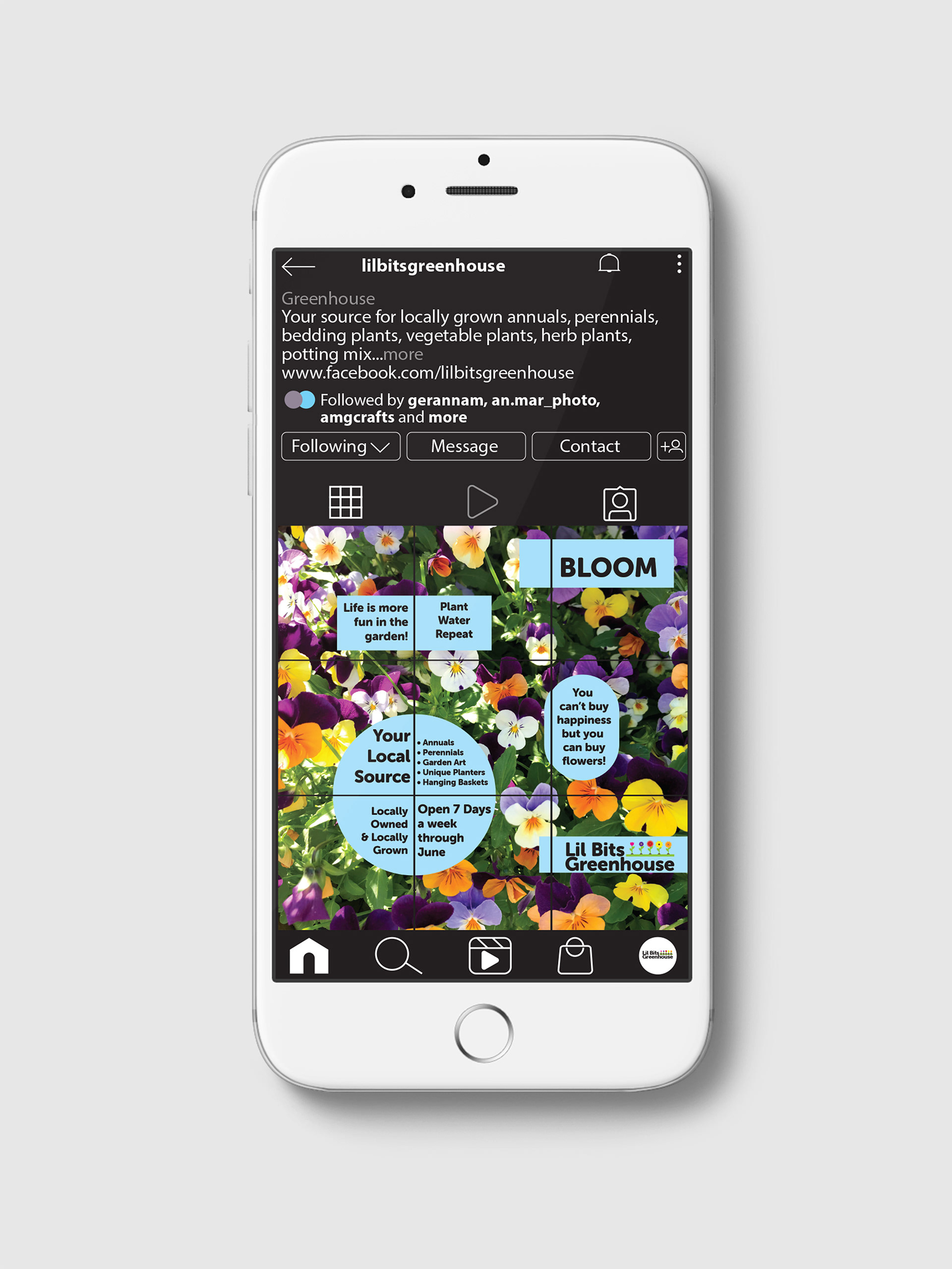
Social media graphics were created with a combination of photography, typography, and brand illustrations. Designed to create a cohesive grid on Instagram, the graphics allowed flexibility for promotions and seasonal messaging.
Lil Bits Greenhouse 2019