Editorial & Publication Design
A curated selection of work exploring typographic hierarchy and visual storytelling across publication formats.
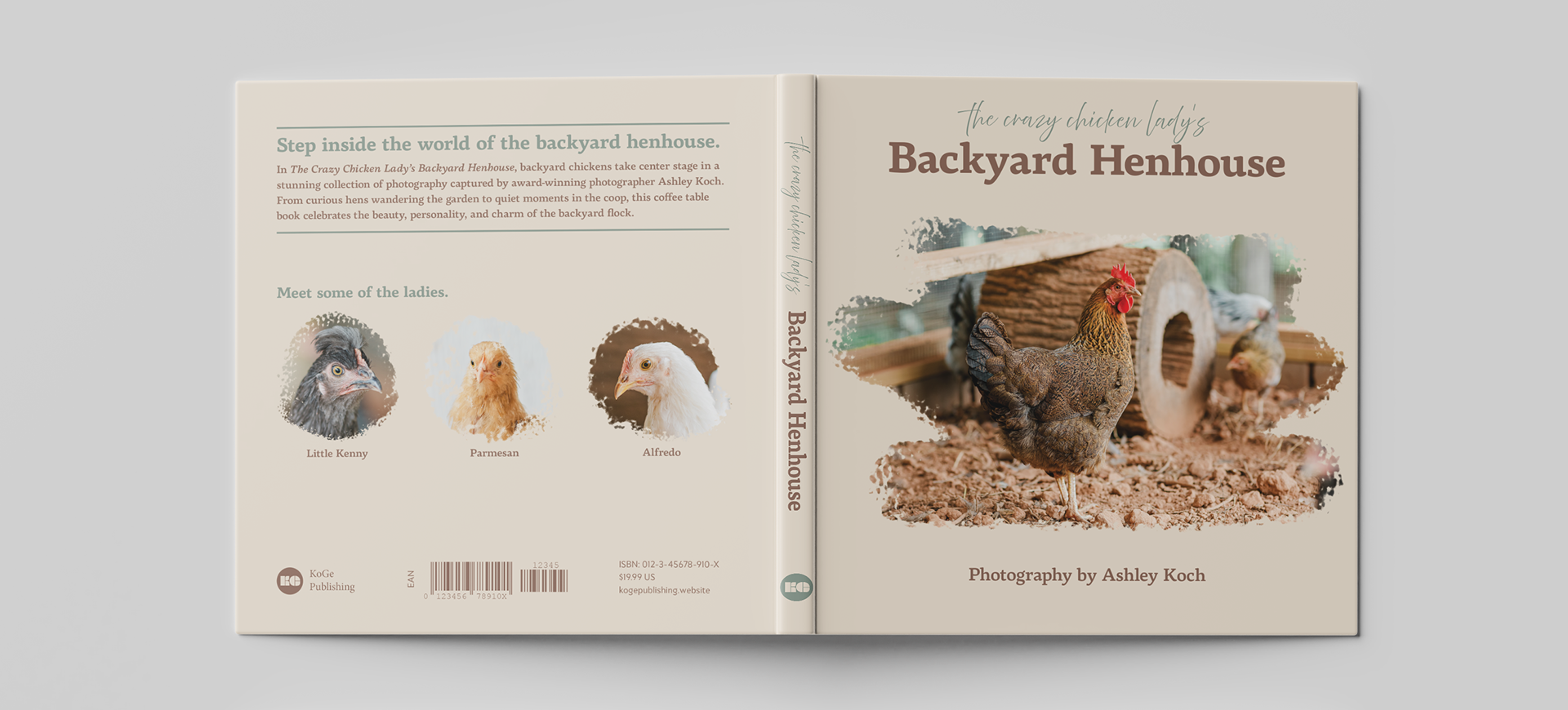
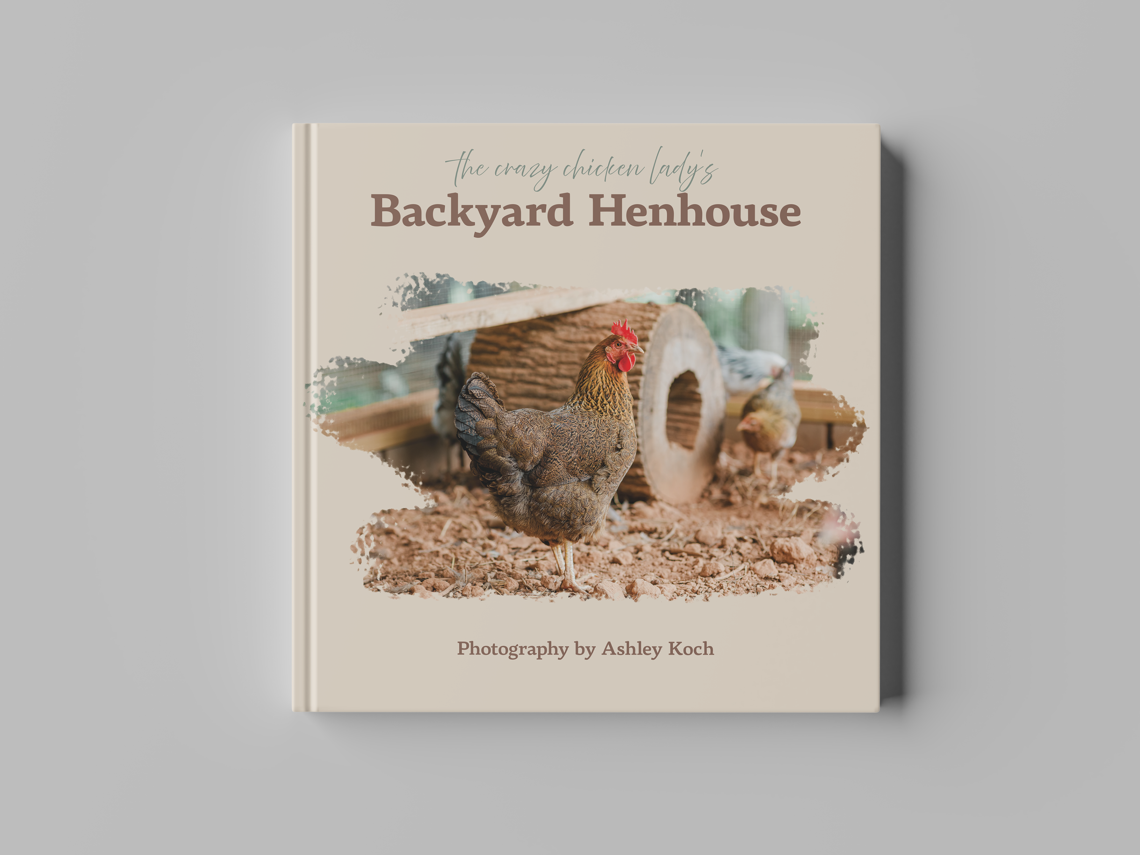
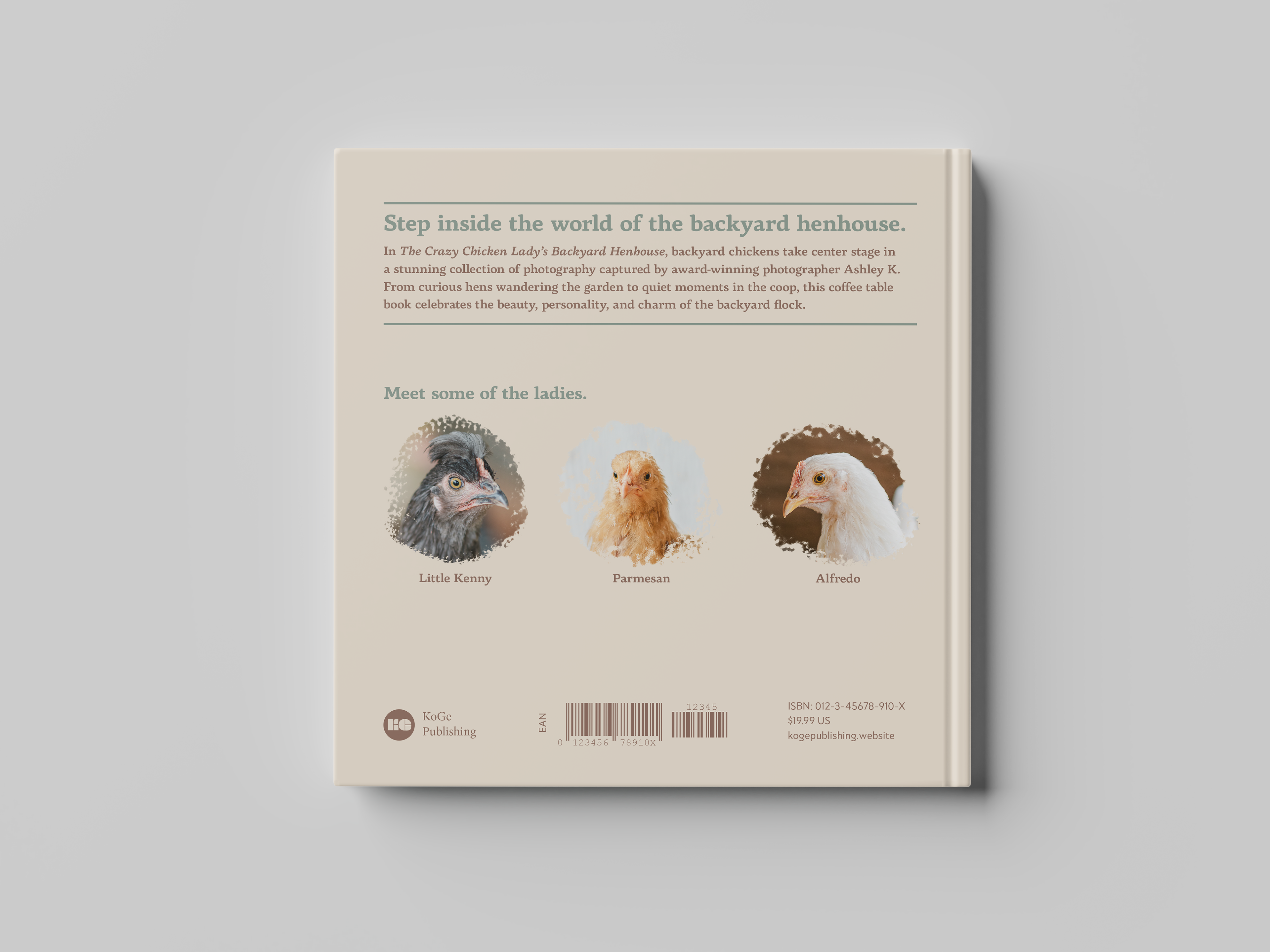
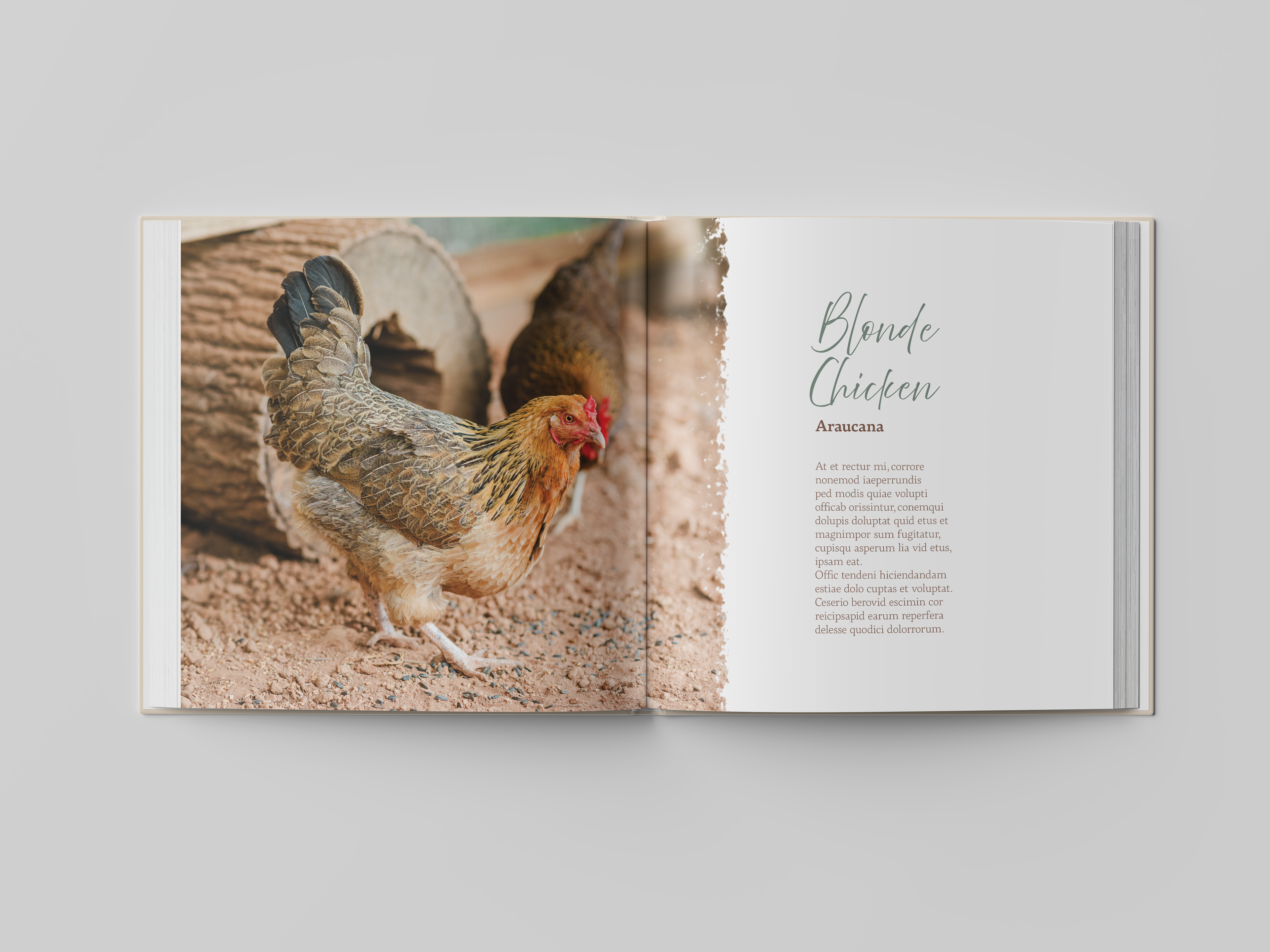
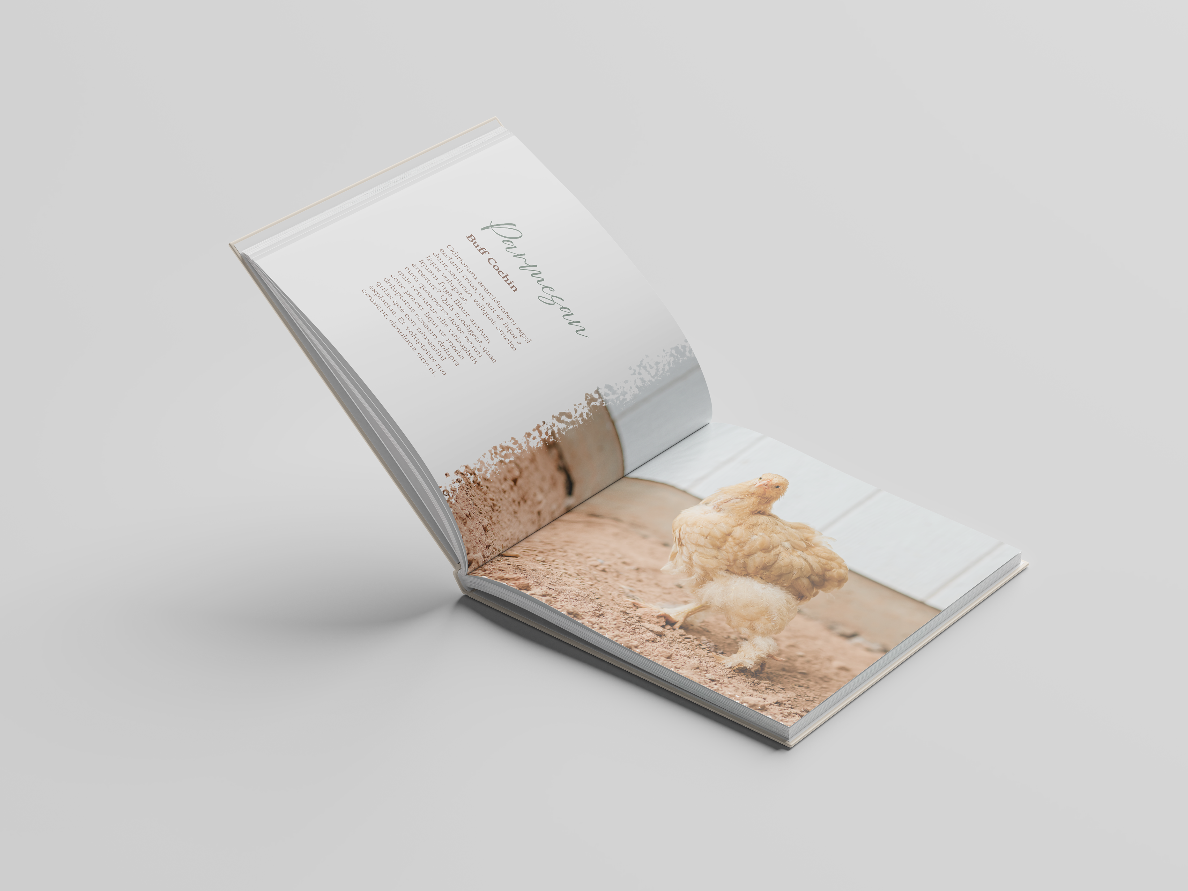
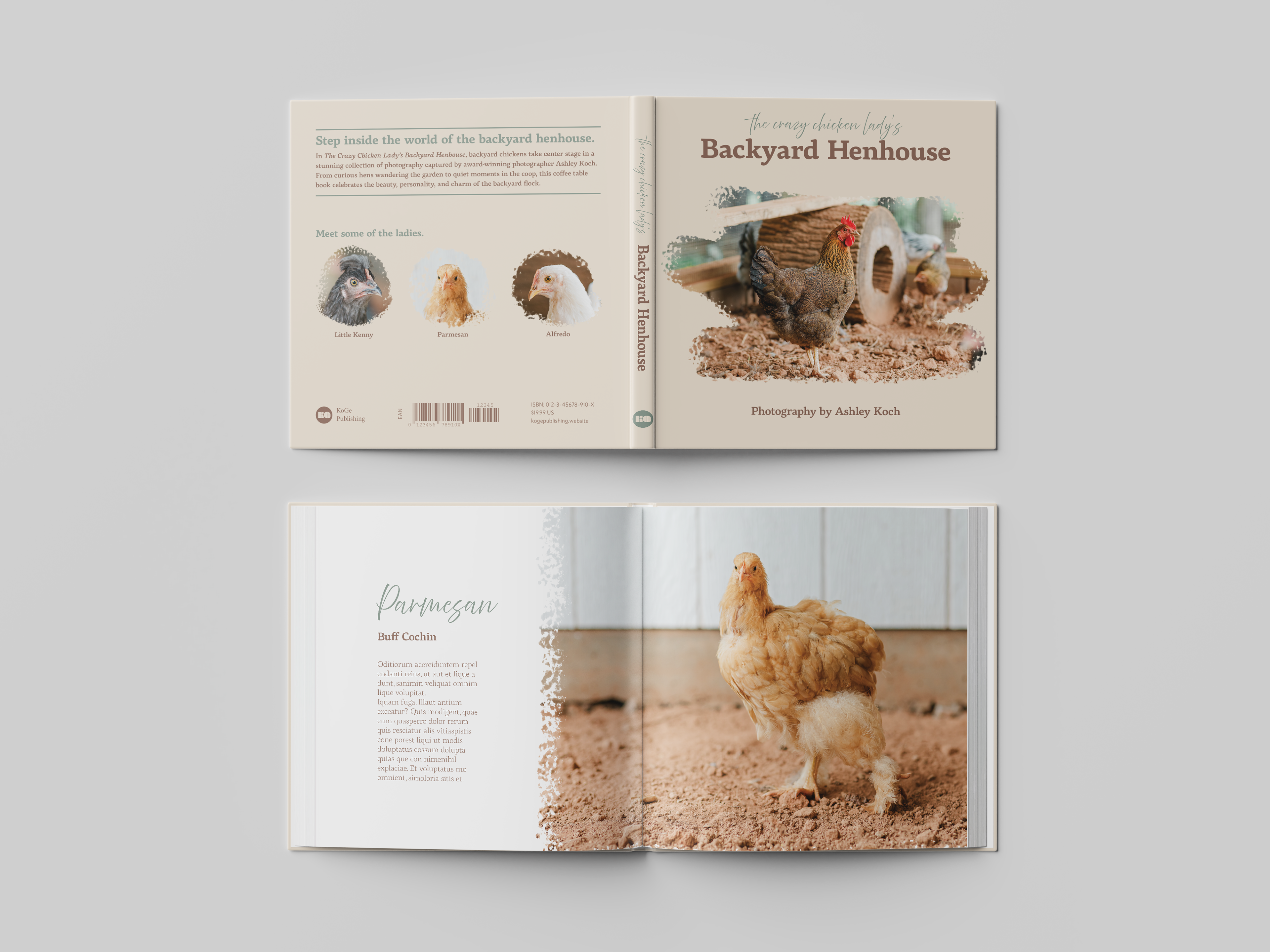
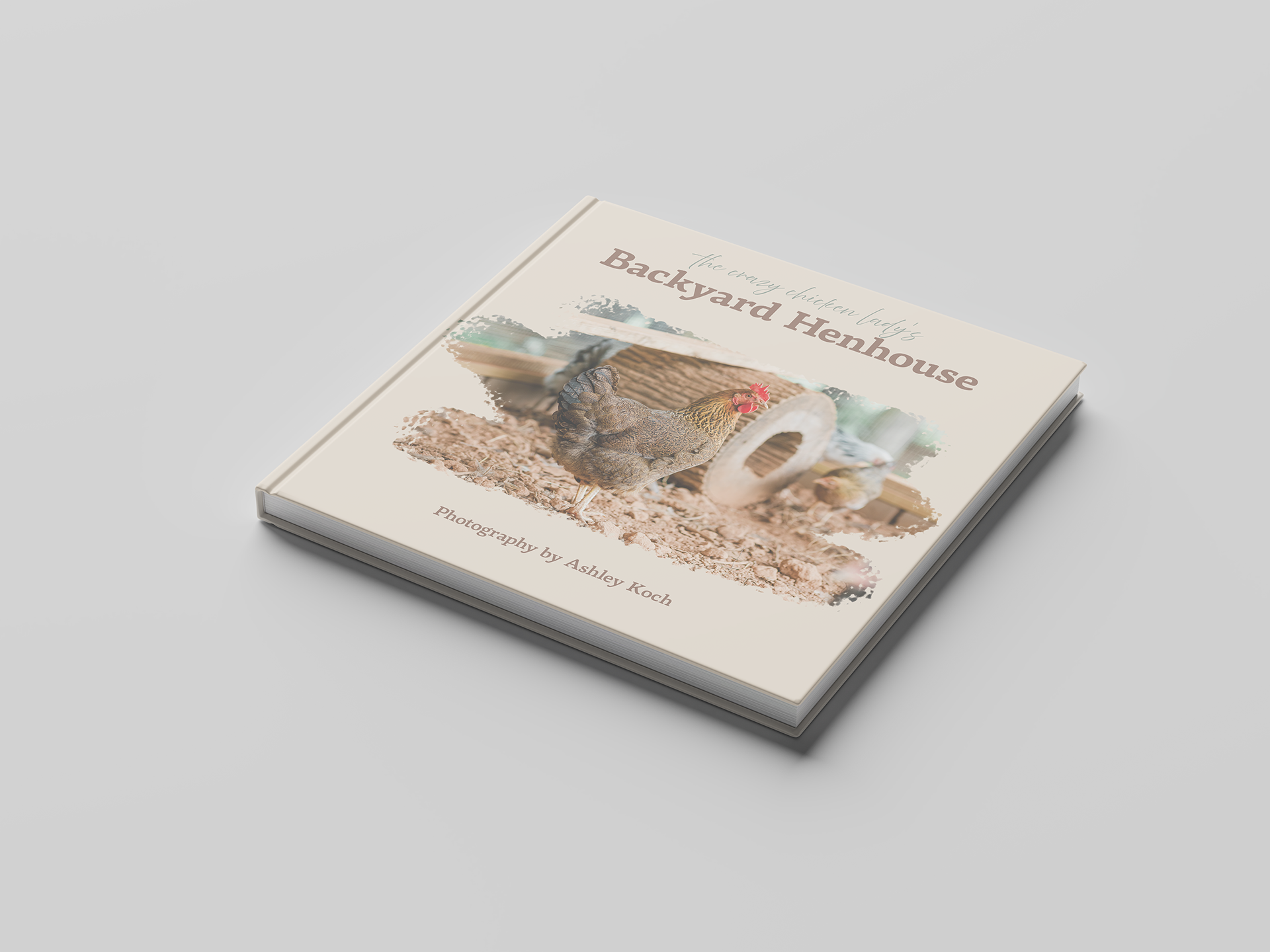
Coffee Table Photography Book
This coffee table book concept combines chicken photography with editorial design. The Crazy Chicken Lady's Backyard Henhouse celebrates beautiful photography while exploring composition, page layout, typography, and visual hierarchy.
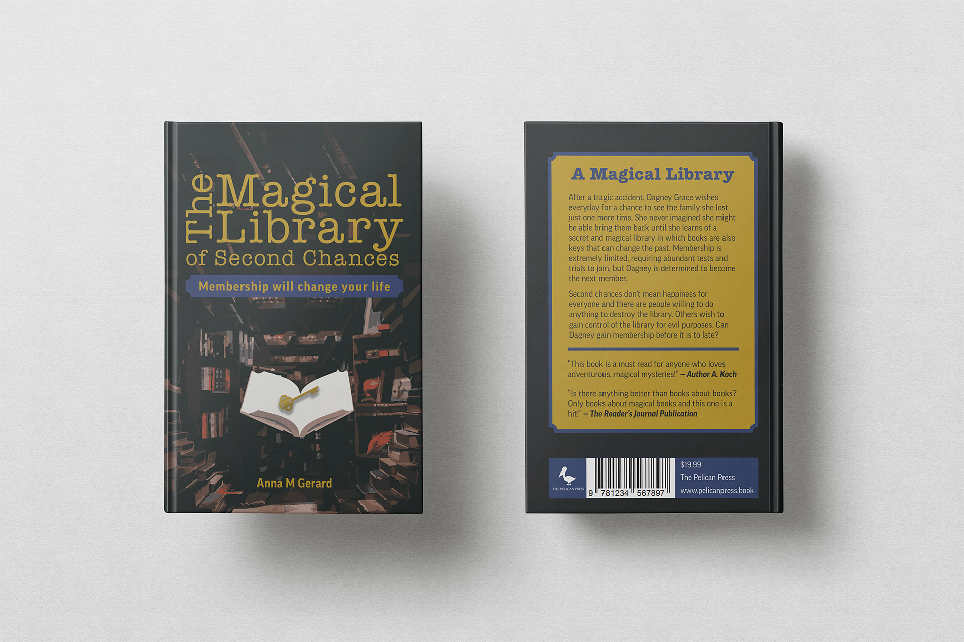
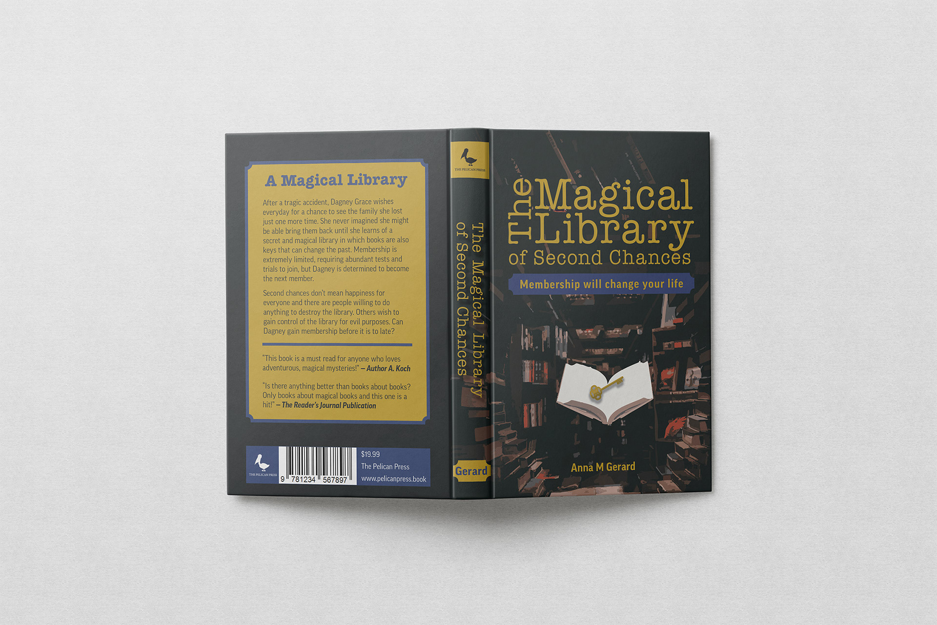
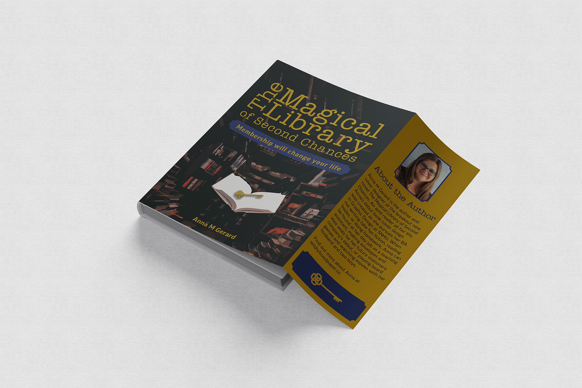
Book Jacket
The book jacket concept focuses on mood and storytelling. A dimly lit library environment creates depth and atmosphere, while the illuminated open book with key becomes a focal point, tying directly into the storyline of the book. Gold typography reinforces the magical tone and establishes strong hierarchy against the darker background. The complete wrap design demonstrates attention to spine alignment, back cover composition, and creating a unified design.
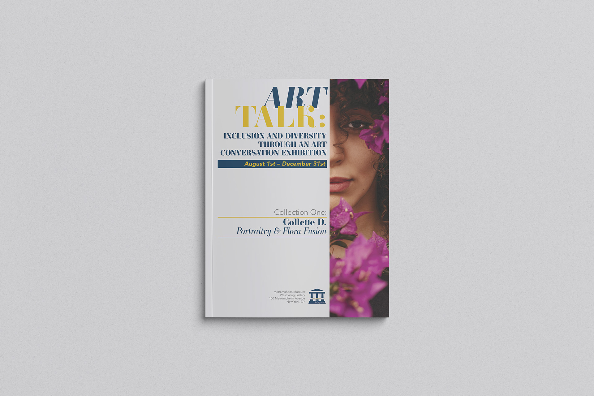
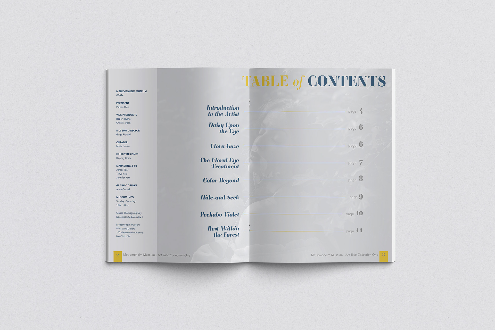
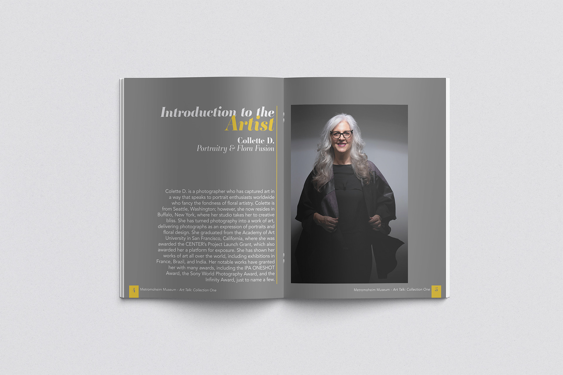
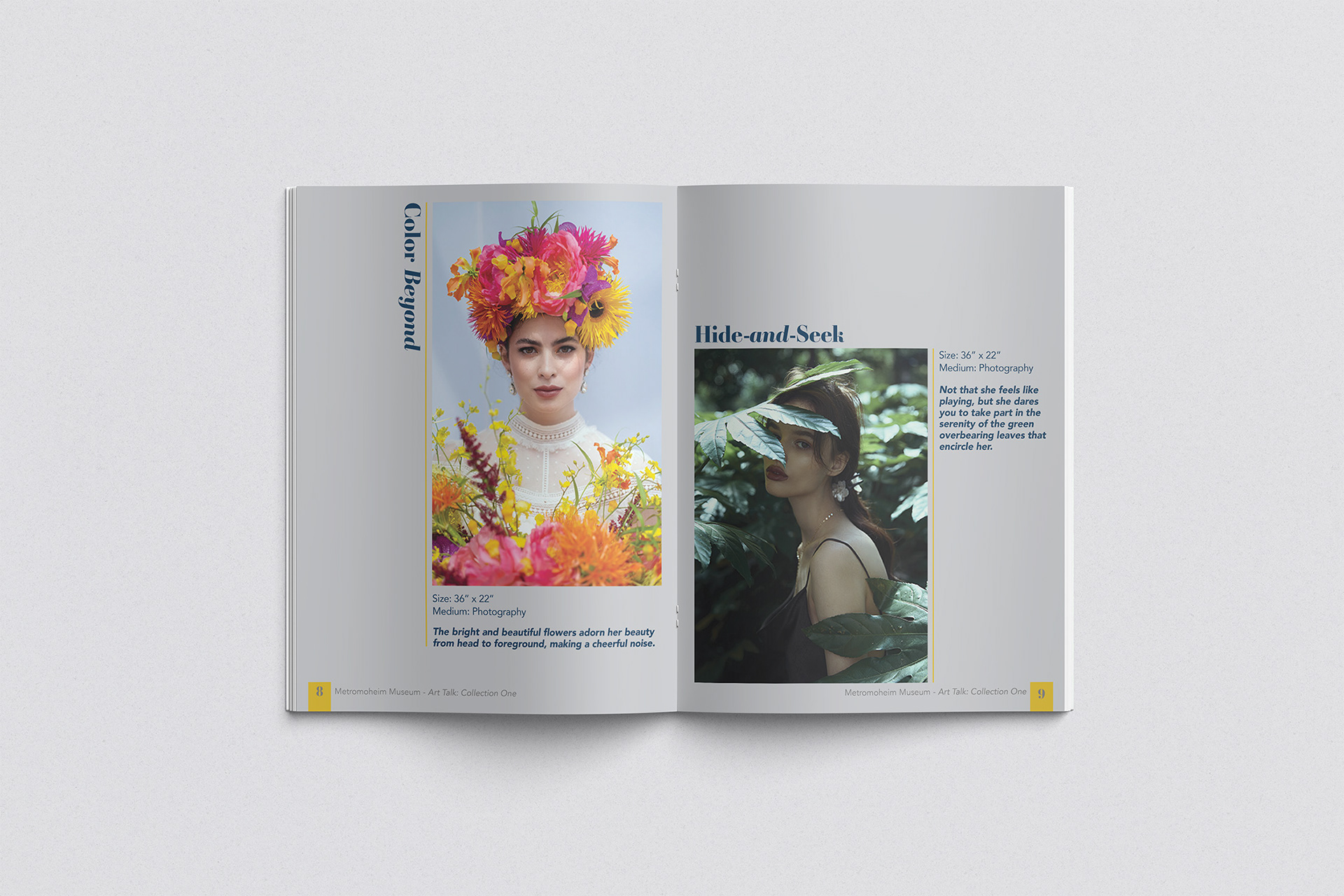
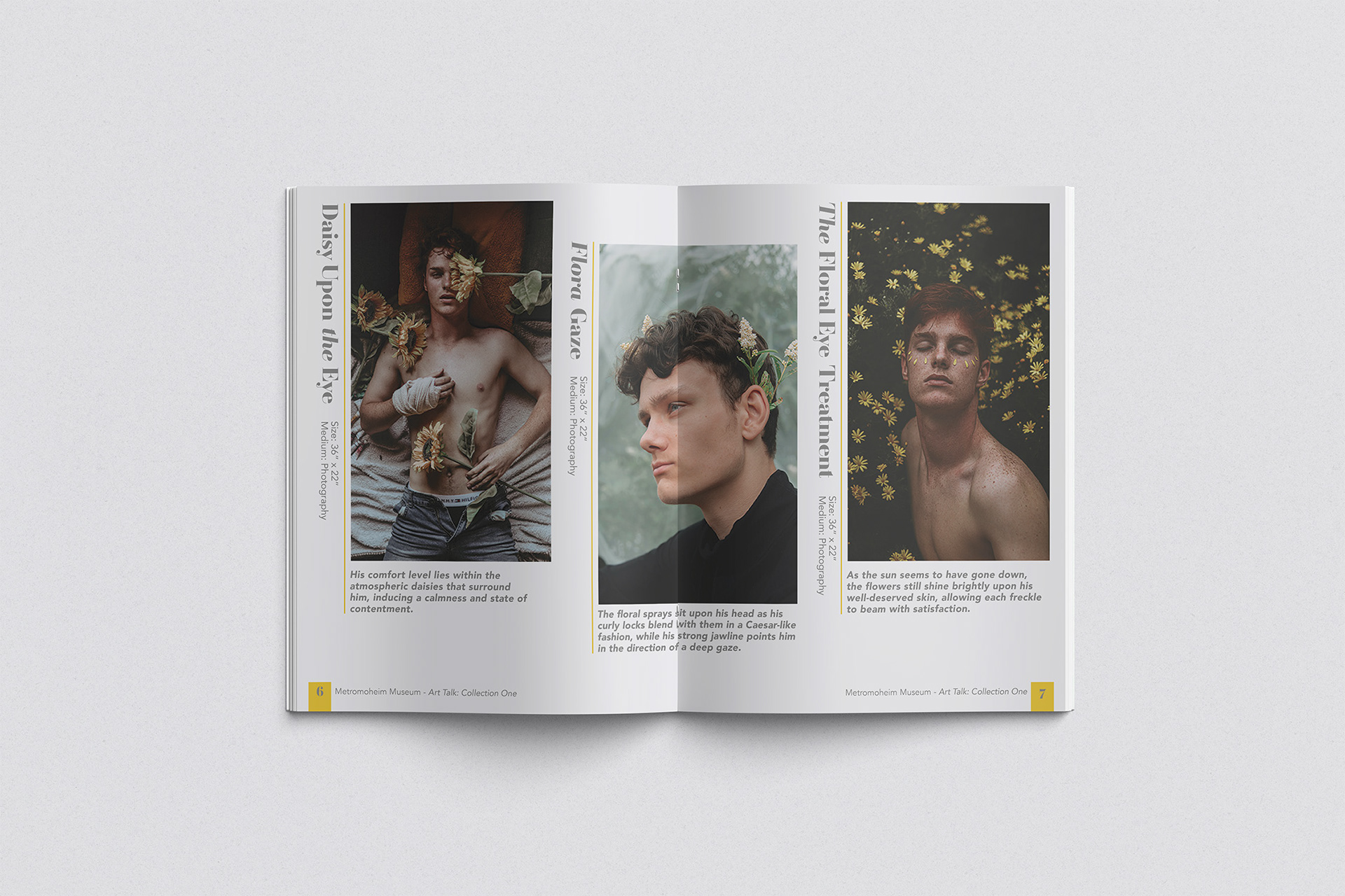
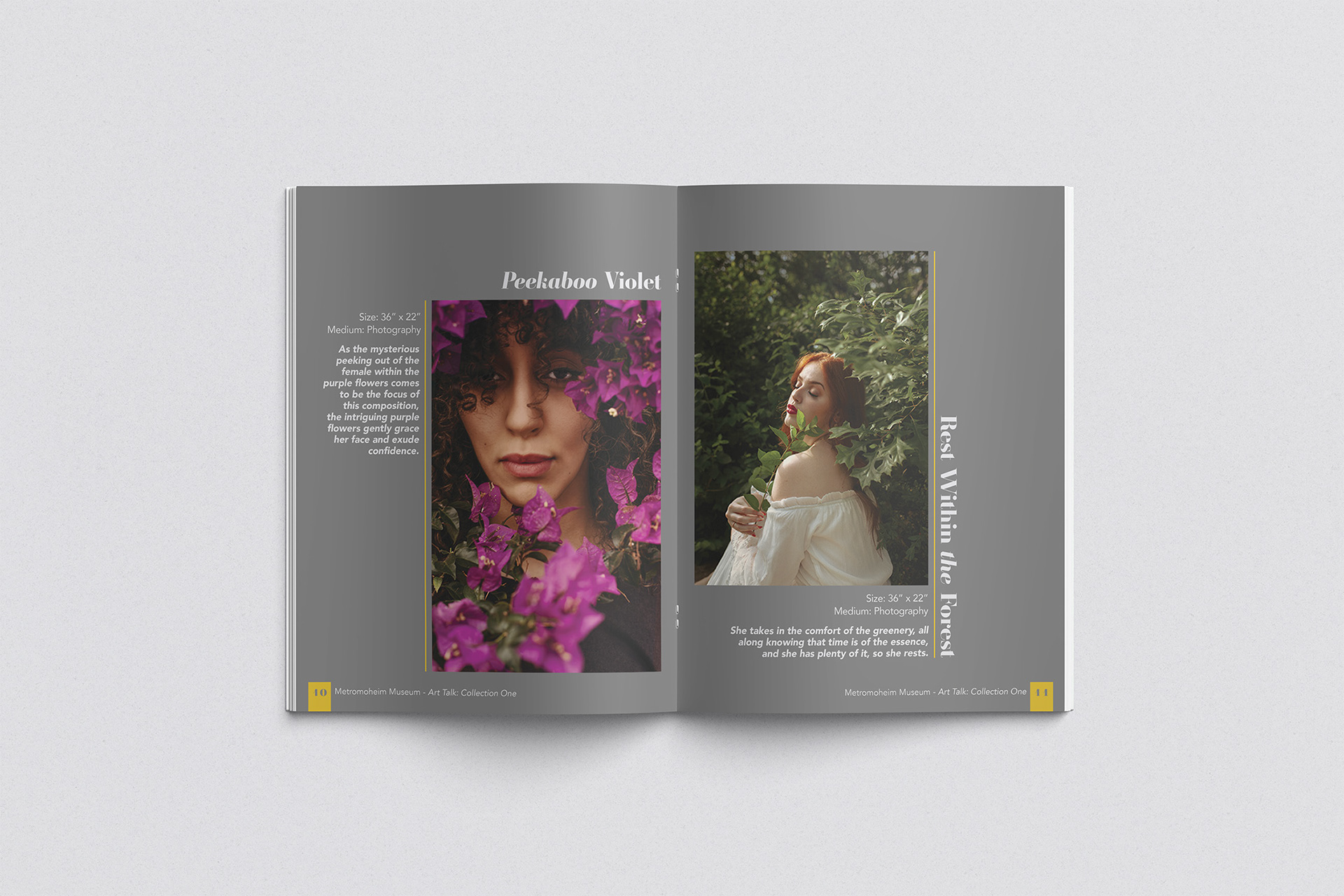
Art Exhibition Catalog
This catalog explores a structured grid system applied across multiple pages to develop cohesive page layouts. While each spread maintains similar features such as the shape of image frames, use of vertical and horizontal headlines, and repeated use of rules, the content shifts placement to avoid overly repetitive layouts. Institutional details, including museum staff listings and operational information, are included to mirror real-world publications.
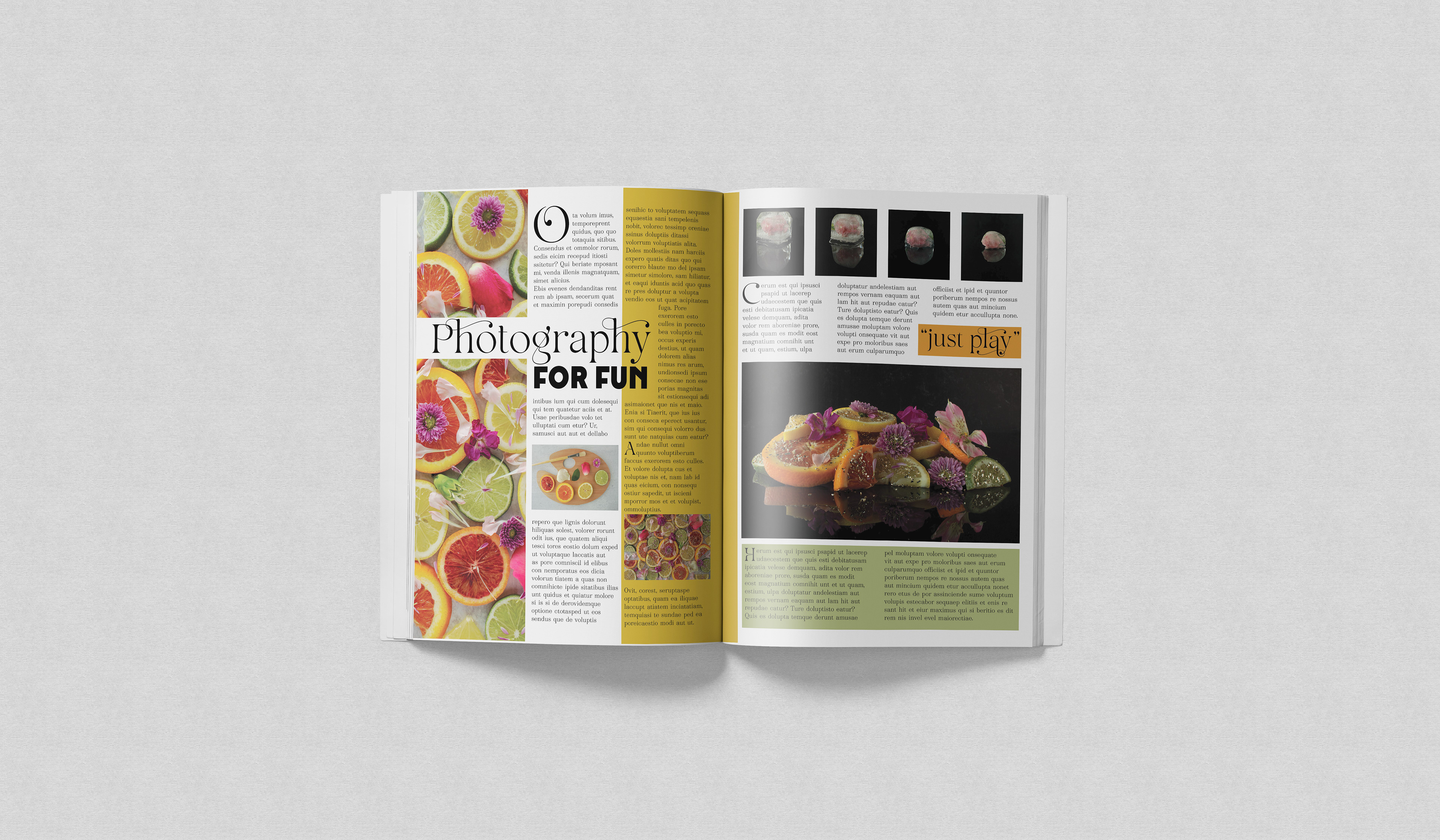
Magazine Article
In this feature article sample, the layout emphasizes clarity and hierarchy across a two-page spread. Strong imagery establishes focal points, while a consistent grid system ensures alignment and long-form readability. Color is used to create emphasis and structure.
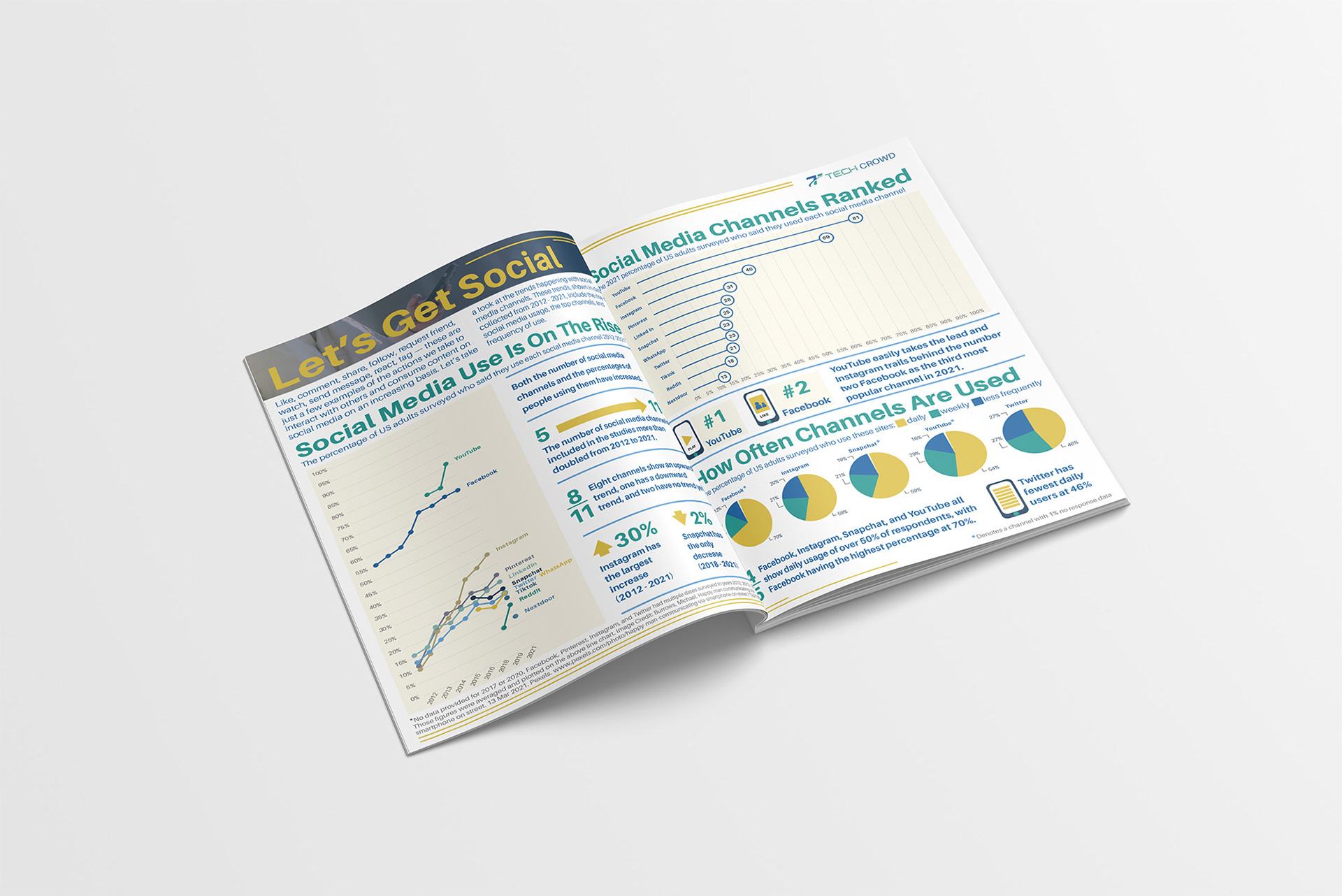
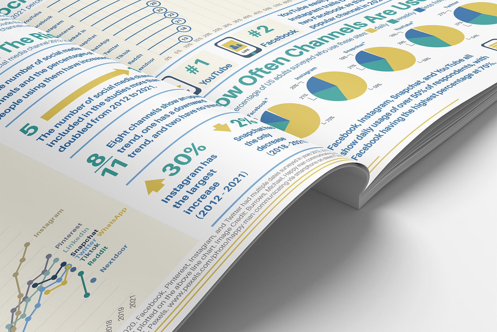
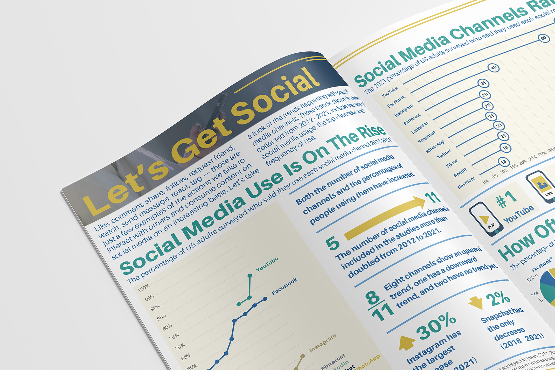
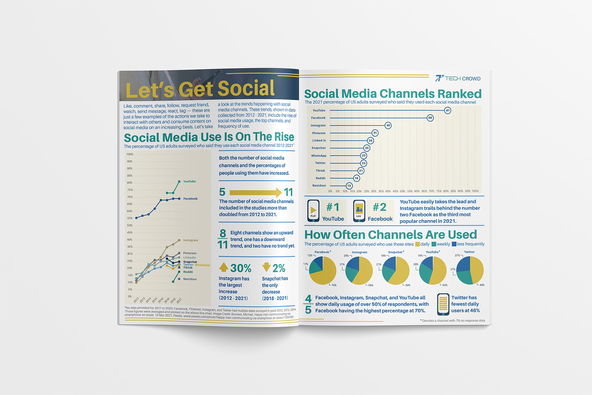
Infographic Layout
This infographic was designed as a two-page magazine spread. The editorial layout uses infographic elements to present information in a clear and engaging format. Structured typography, color, and graphic elements create hierarchy and guide the reader through the content. Illustrations and data callouts add visual interest as well as breaking data into easily scannable segments.