Client Overview
Wildly Loved Mushrooms LLC is a gourmet mushroom farm located in Upstate South Carolina. The business grows a variety of specialty culinary mushrooms in an indoor controlled environment. The mushrooms are sold directly to consumers, restaurants, and local markets.
The primary audience includes home cooks, farmer's market shoppers, and local restaurants seeking locally grown specialty ingredients. The brand identity was developed to support packaging, market displays, and digital promotion.
Deliverables
Logo + Identity System
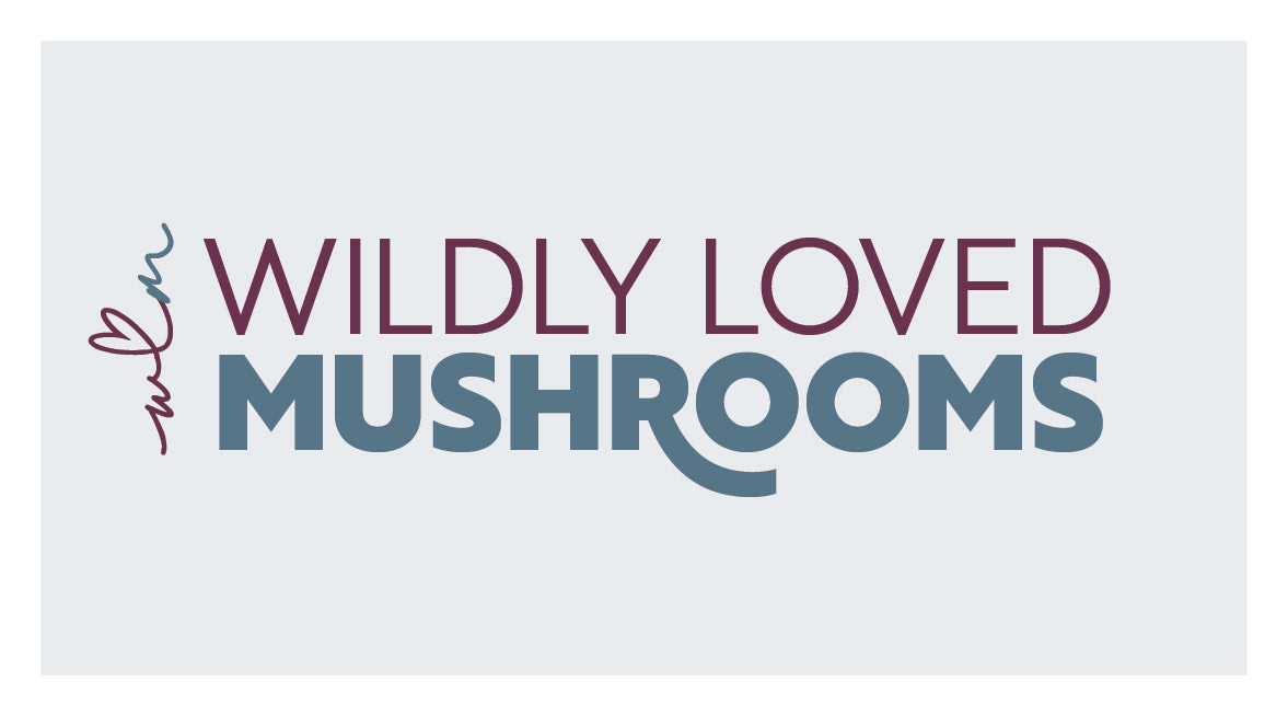
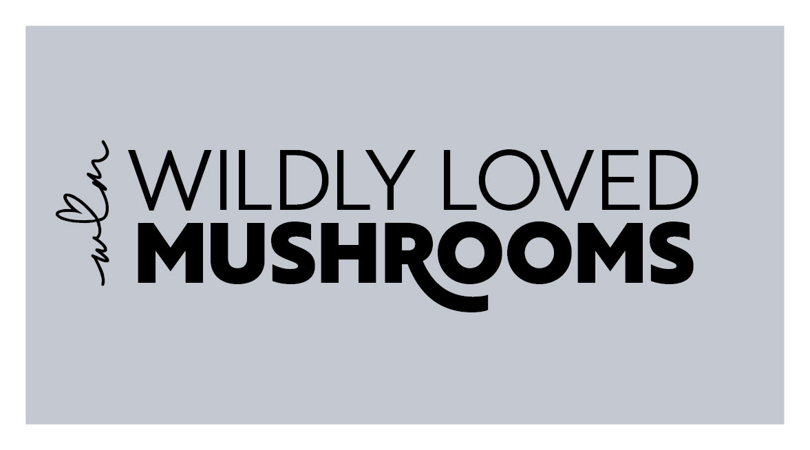
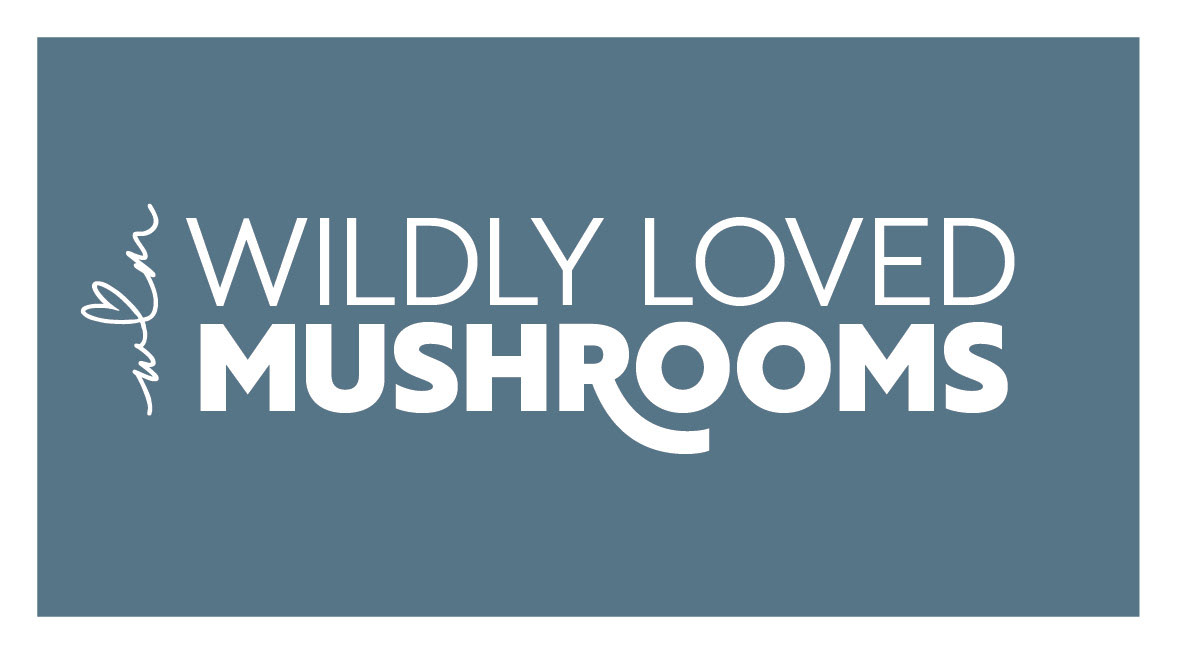
The logo system was created for versatility across packaging, signage, and digital platforms. Variations include two variations on the primary logo, one vertical and one horizontal, as well as a sub-mark optimized for small space applications. All three variations were delivered in full color, single-color black, and single-color white for use on a variety of backgrounds.
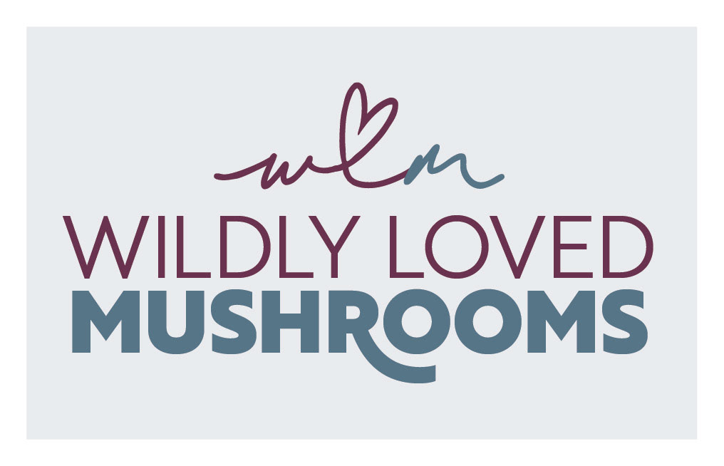
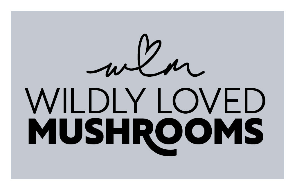
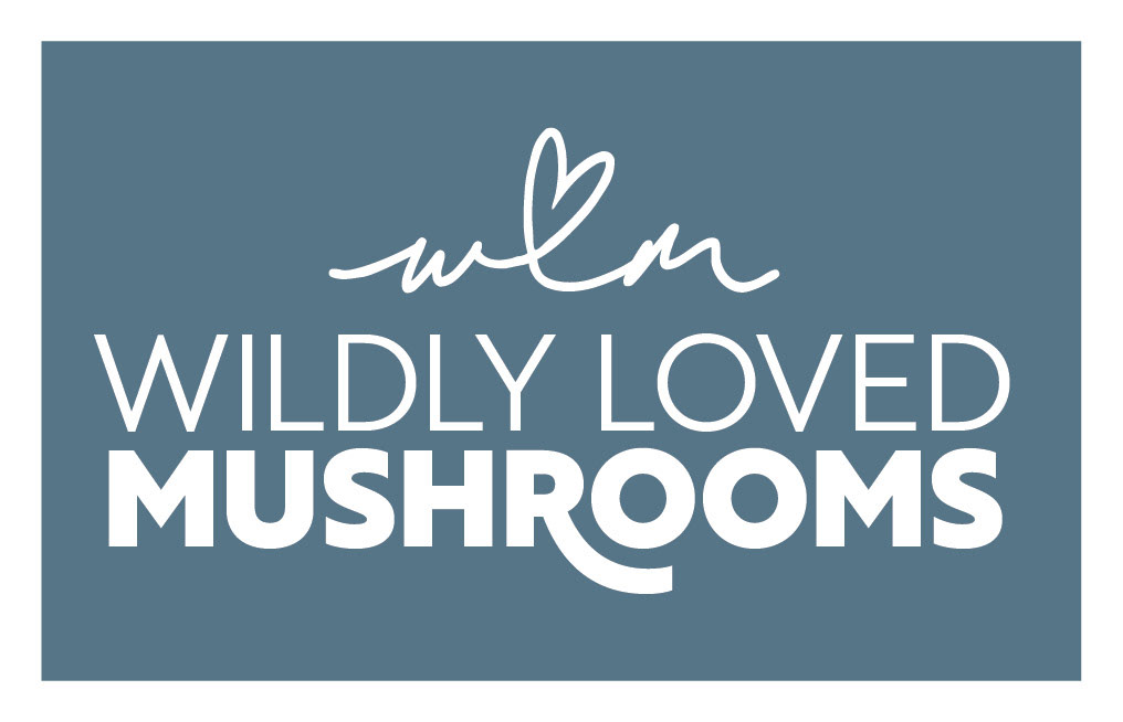


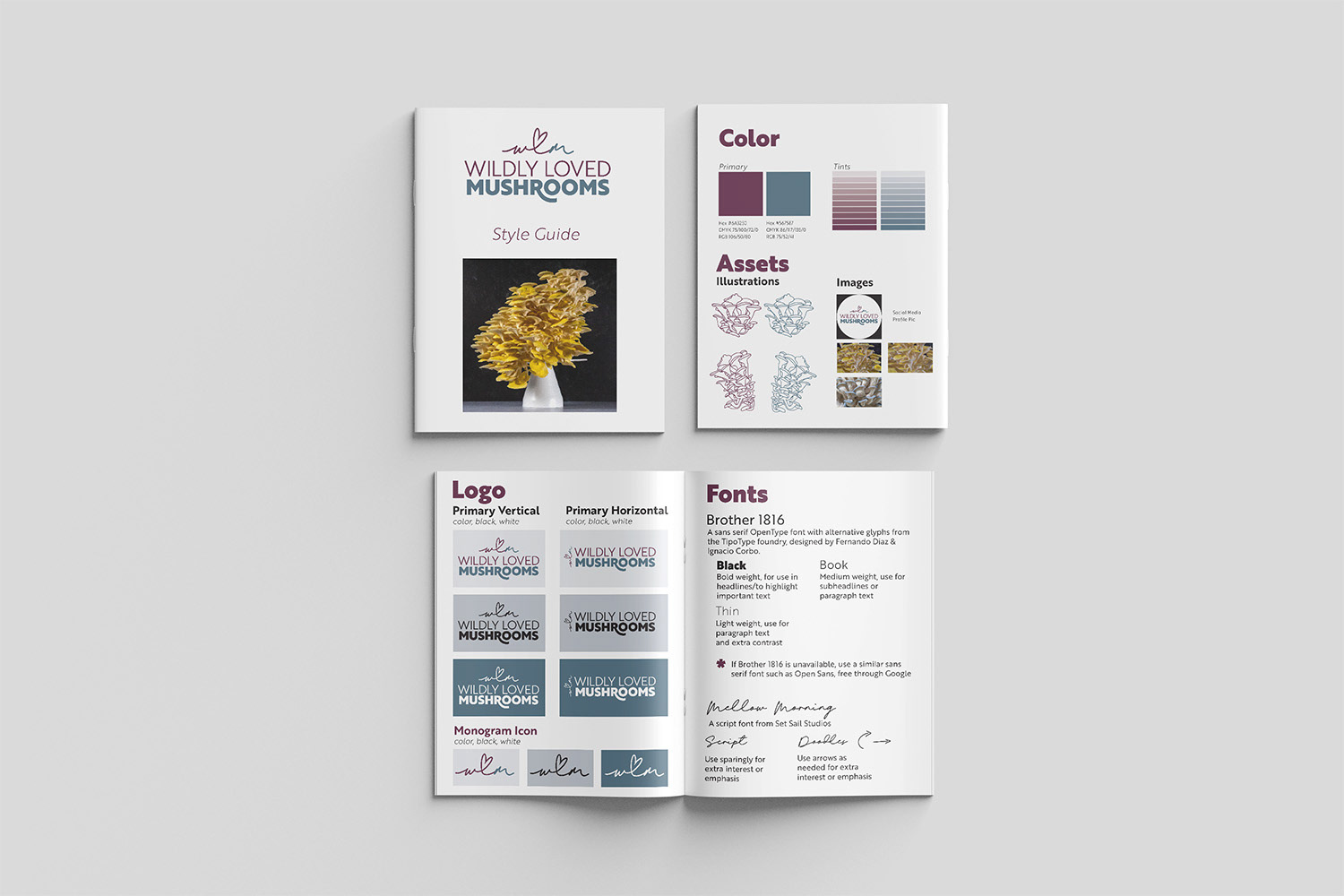
A style guide was provided for quick reference to logo variations, color palette, font usage, and graphic assets.
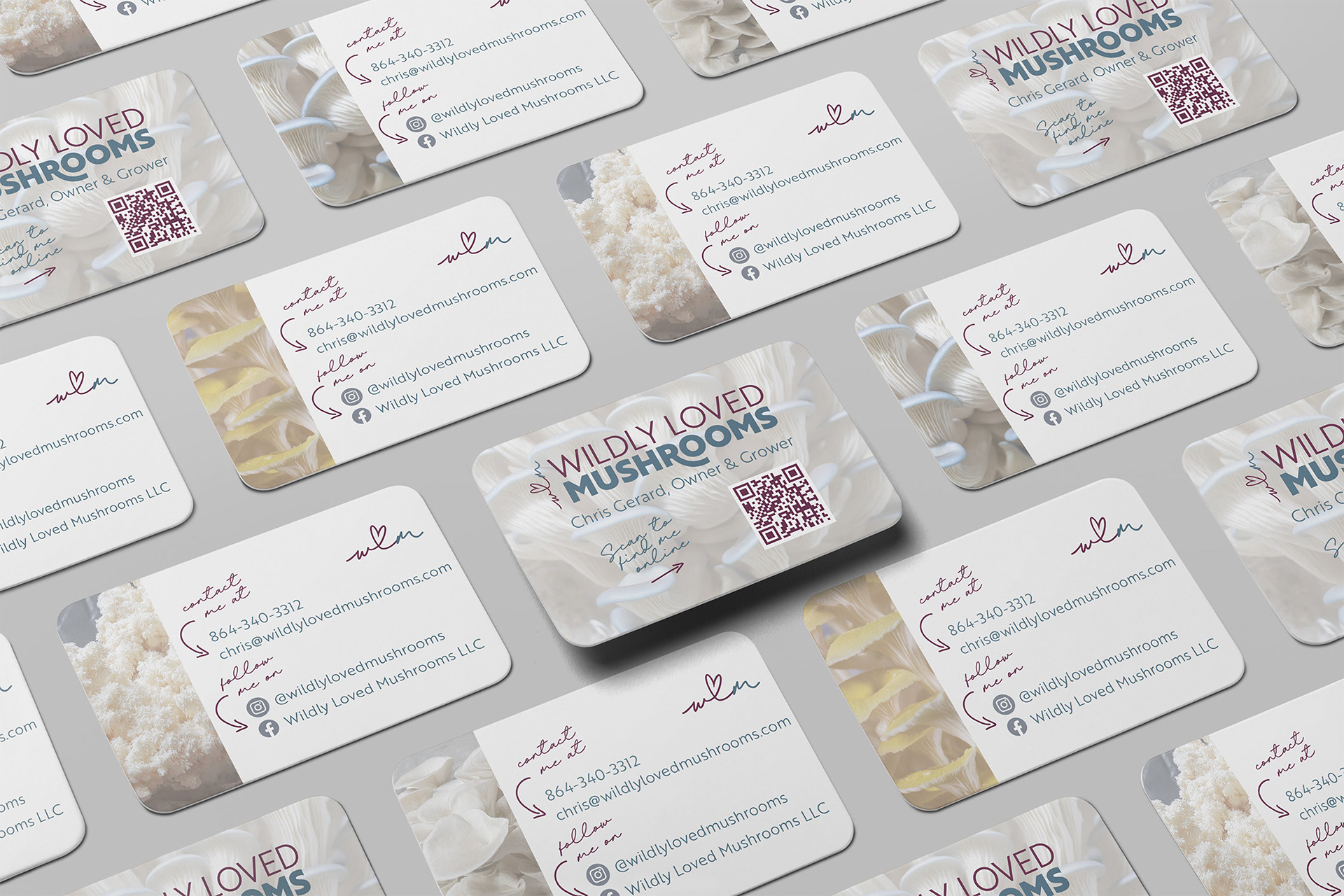
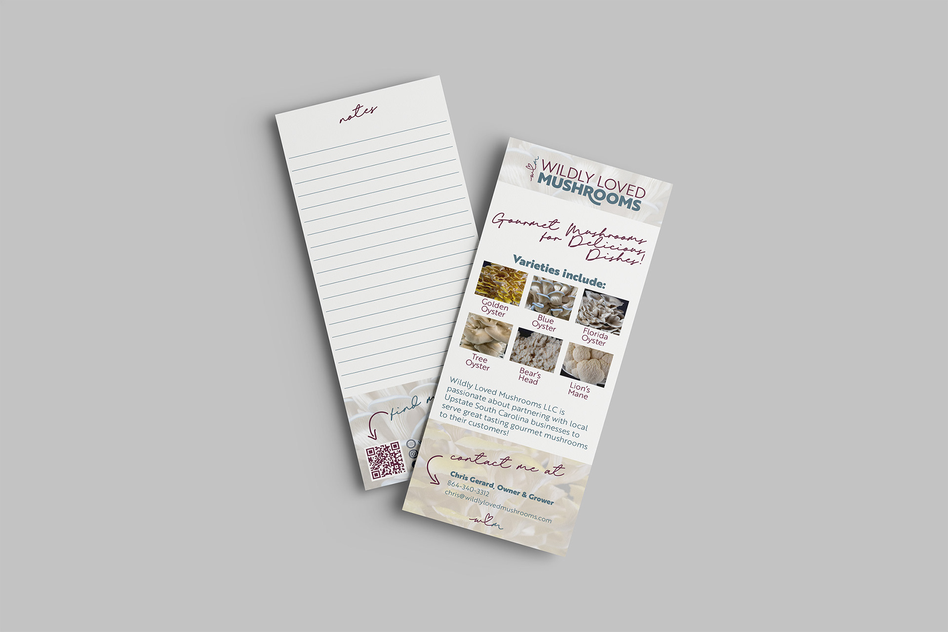
Print Collateral
Print collateral was designed for direct customer interaction and wholesale outreach. Taking advantage of the printer's backside variations at no cost, the business cards become a mini portfolio of mushroom varieties for market-goers to take home. A rack card designed for restaurant and market visits includes space for notes on pricing and more.
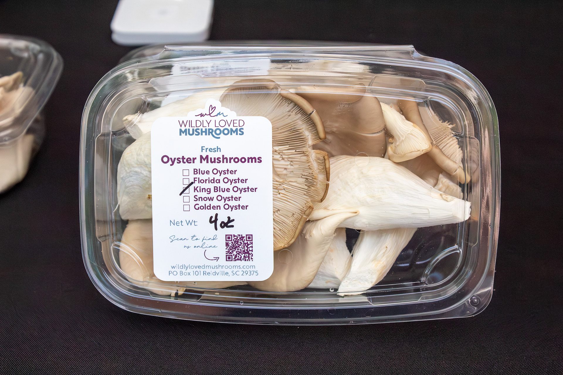
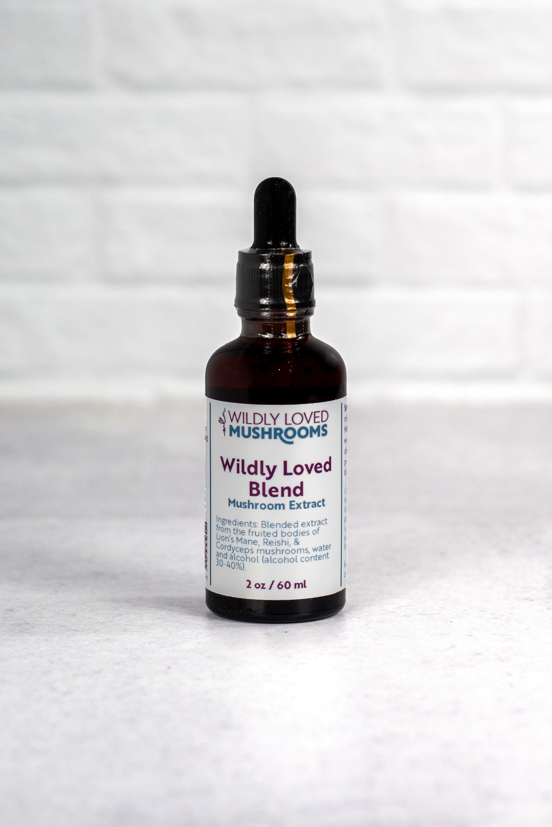
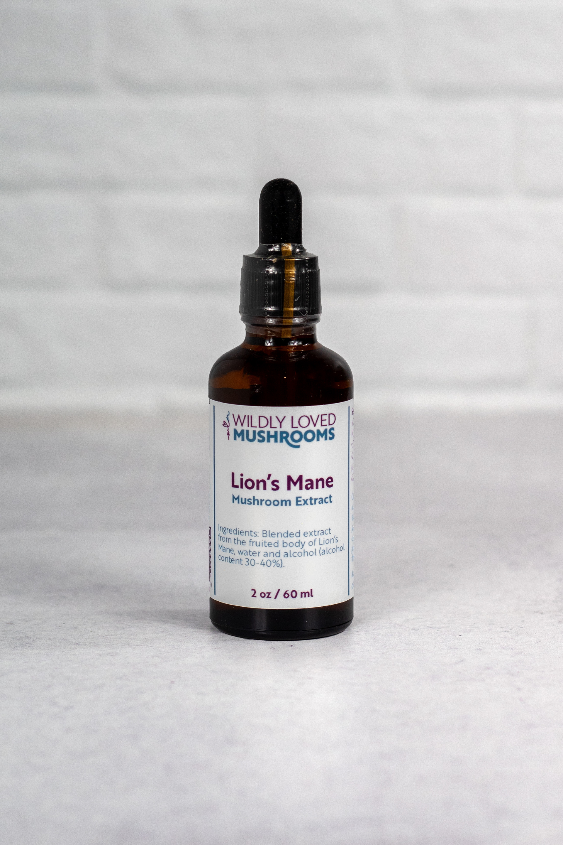
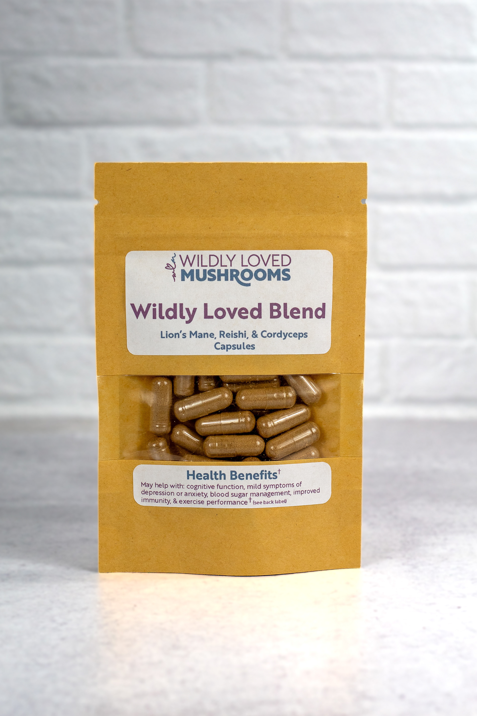
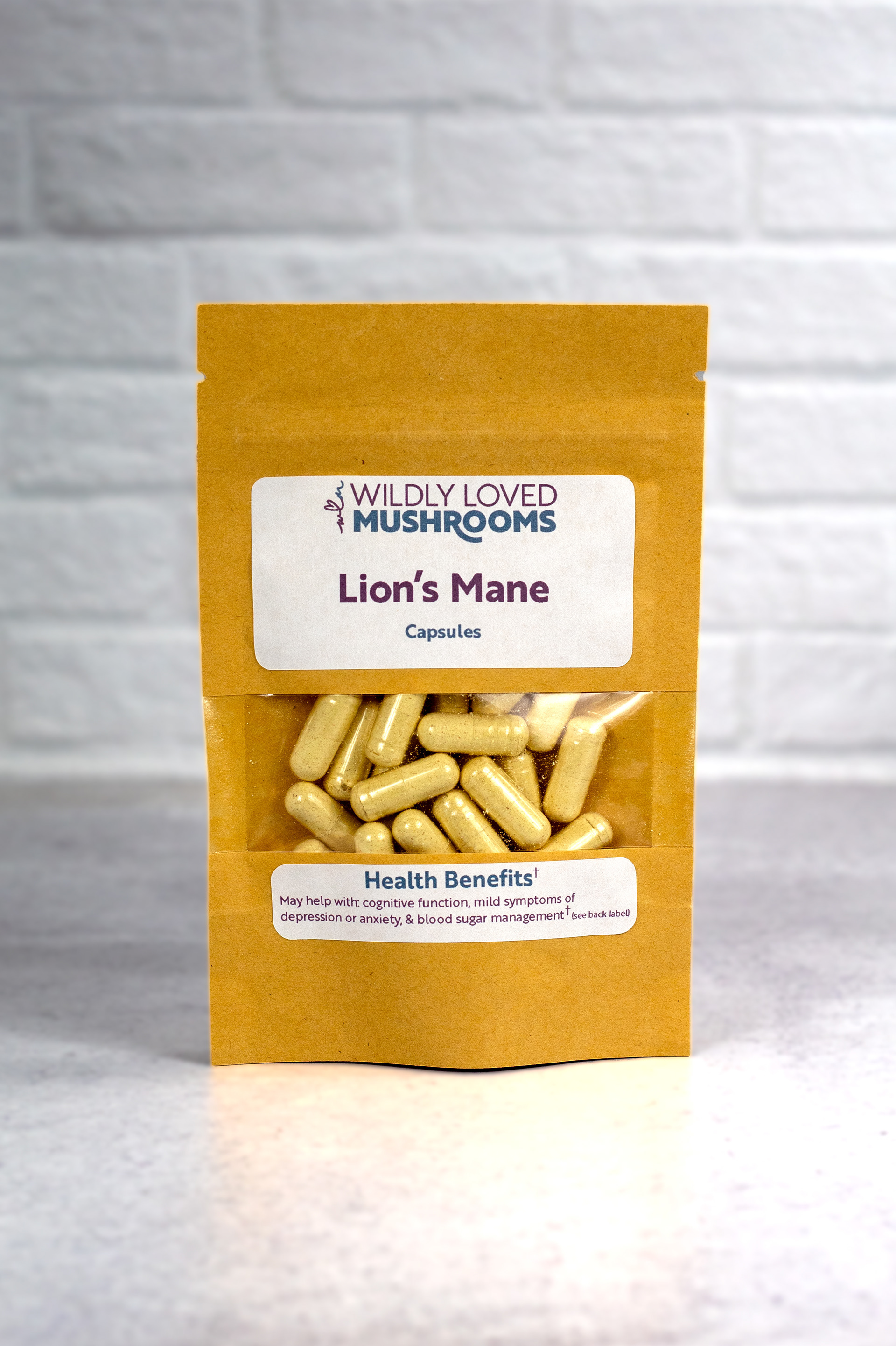
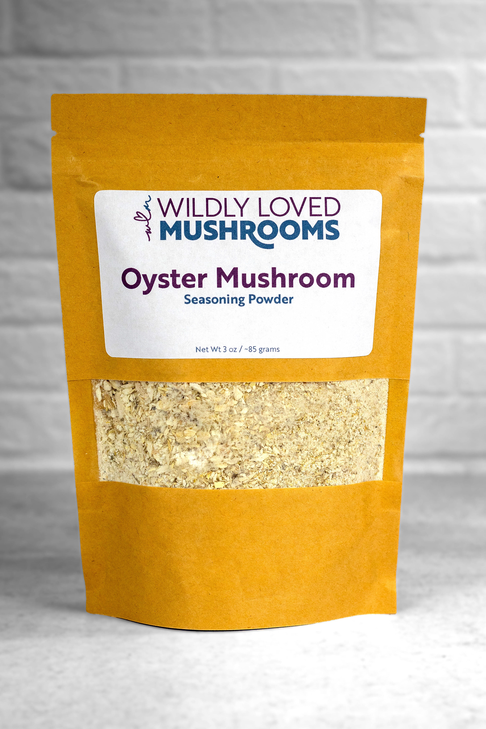
Packaging & Label Design
Packaging labels were designed for clear product communication. The system supports multiple mushroom products while maintaining a cohesive visual identity through consistent typography, color palette, and layout structure.
Labels were formatted for small-batch printing and hand application, allowing flexibility for seasonal harvests and market inventory.
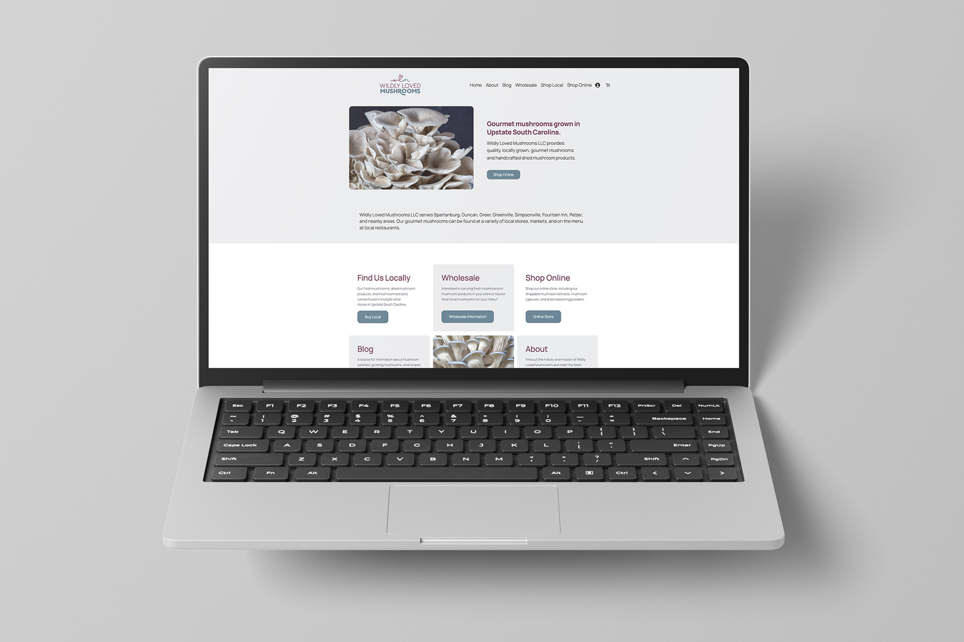
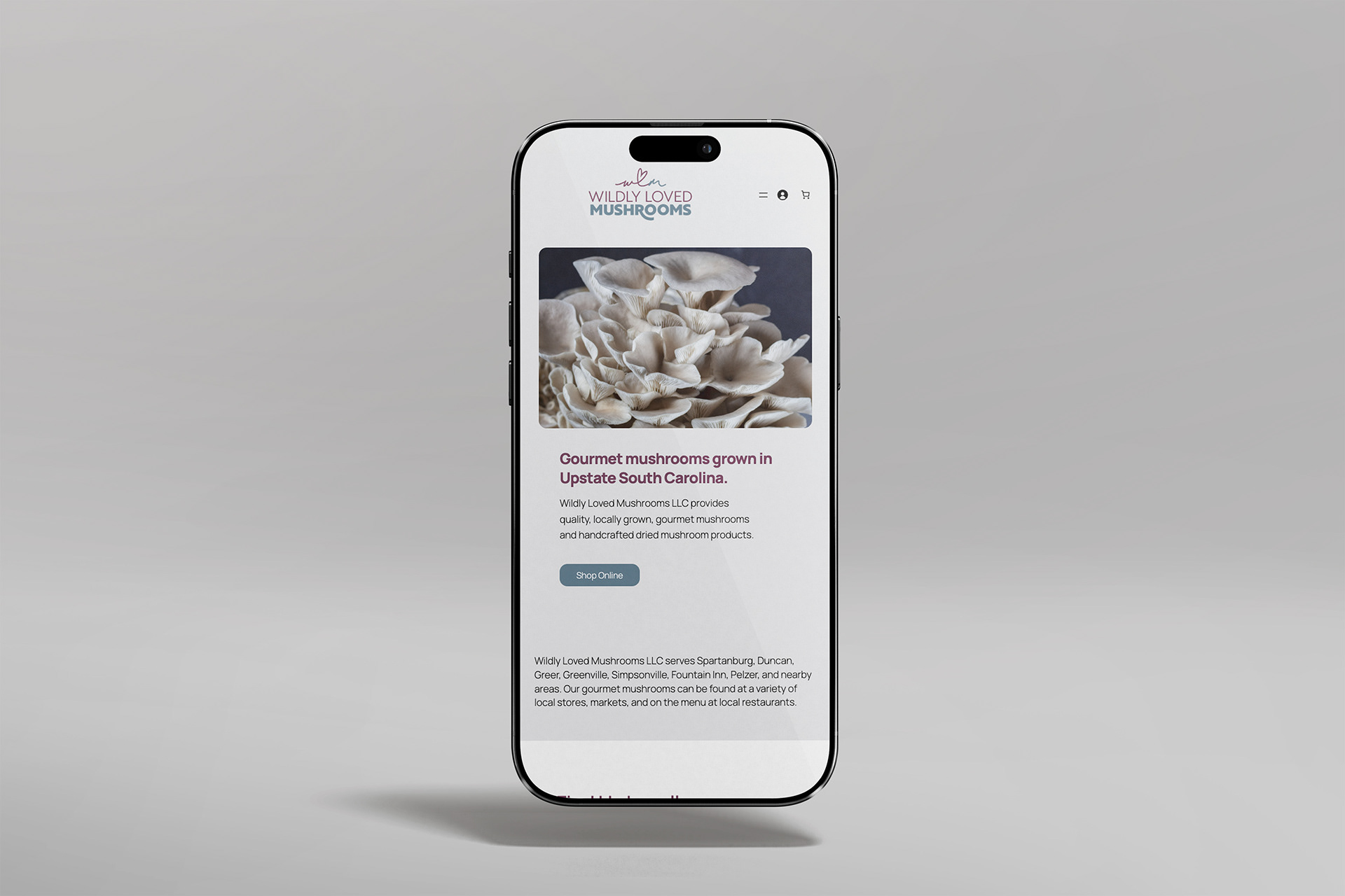
Website Design
The website was developed to translate the brand's identity into a digital presence. Consistent typography and brand color combine with a clean layout to become an extension of the visual system developed for print and packaging materials.
Outside of brand recognition, the priority of the site is good user experience. To accomplish this the website has clear and easy navigation, visual hierarchy, easy to find information, supportive images, an emphasis on accessibility through alt text and color contrast, and responsive design.
Outside of brand recognition, the priority of the site is good user experience. To accomplish this the website has clear and easy navigation, visual hierarchy, easy to find information, supportive images, an emphasis on accessibility through alt text and color contrast, and responsive design.